
A design system your AI can read.
One file that carries your whole brand: color tokens, typography, spacing, components and voice, written in markdown that Cursor, v0, Lovable and human developers all understand. Logofai generates it from your logo in about a minute.
Included on Pro and Business plans · comes with a live style guide
design.md is a single markdown file that carries a complete design system: color tokens for light and dark mode, typography with a full type scale, spacing and layout rules, component specs, motion guidelines, accessibility standards, logo usage, and brand voice. Because it is plain markdown, AI coding tools (Cursor, Claude Code, v0, Lovable, Bolt, Windsurf) can read it directly and style an app to match the brand, and human developers can review it in any editor. Logofai generates a design.md from your logo in about a minute: twelve sections, zero ambiguity, plus exports as CSS variables, a Tailwind config, and W3C design tokens JSON, with a live HTML style guide. It costs 9 credits on Pro and Business plans. Instead of a brand PDF developers never open, the brand ships as a file the codebase can actually use.
--primary: #4D0D2E;
--accent: #660A3A;
--bg: #FDFDFD;

## Brand essence
- Loud discipline: high-impact,
never sloppy.What is a design.md? The file, explained.
A design.md is a markdown document that describes a complete design system in plain text. Instead of a 60-page brand PDF nobody opens, everything a builder needs lives in one file: exact hex tokens for light and dark mode, a full type scale, spacing and radius rules, component specs, motion, accessibility and the brand’s voice.
Because it is plain text, it works everywhere. AI coding tools read it as context and stop guessing your colors. Developers read it as a spec. Designers read it as documentation. Drop it in a repo, paste it in a prompt, or hand it to an agency, it is the same source of truth in every case.
What’s inside. Twelve sections, zero ambiguity.
Every Logofai design.md follows the same structure, extracted from your logo and art direction.
Three lines that pin down the attitude, plus the tagline.
Light and dark mode CSS variables with usage notes for every token.
A Google Fonts pairing and an 11-level type scale with exact sizes.
An 8-based spacing scale, container widths, grids, radii and elevation.
Variants, sizes and states, down to hover lift and disabled opacity.
Base, feature, pricing, testimonial and promo card specs.
Field sizing, focus rings, and error states that stay accessible.
Writing rules, example headlines, product copy and FAQ answers.
Easing curves, durations, and reduced-motion rules.
Contrast minimums, target sizes and focus-visible rules.
Minimum sizes, clear space, and do / do not placements.
The whole brand, summarized as decisions a builder can follow.
A real one. Unedited.
This is the actual design.md Logofai generated for Strike9, a streetwear label built from a single prompt. Read the file, then flip the tab to see the exact style guide the app rendered from it. Copy it into Cursor or v0 and your next page comes out in Strike9’s berry-black palette with Archivo Black headings.
# DESIGN.md — Strike9

## 1. Brand essence
- Loud discipline: high-impact, never sloppy.
- Night-market grit: built for concrete, queues, clubs, and cold sidewalks.
- Sharp confidence: graphic, direct, and cut with intent.

Tagline: Built loud. Cut for the street.

## 2. Colour tokens

### Light mode
```css
:root {
  --bg: #FDFDFD;
  --surface: #FDFDFD;
  --surface-2: #F3F2F2;
  --text: #141213;
  --text-2: #341124;
  --muted: #6E686B;
  --border: #E2DFE0;
  --primary: #4D0D2E;
  --primary-ink: #FDFDFD;
  --accent: #660A3A;
  --accent-2: #280F1C;
}
```

Usage notes:
- `--bg`: main page background; keep clean to let product and graphics hit harder.
- `--surface`: default card, nav, drawer, and modal fill.
- `--surface-2`: raised panels, table rows, form fills, and soft section breaks.
- `--text`: primary copy and high-priority interface text.
- `--text-2`: subheads, metadata, and editorial text with a brand tint.
- `--muted`: helper copy, timestamps, placeholders, and low-emphasis UI.
- `--border`: dividers, input borders, card outlines, and quiet separators.
- `--primary`: main action colour for CTAs, badges, and key highlights.
- `--primary-ink`: text and icons placed on primary fills.
- `--accent`: drop alerts, campaign moments, sale flags, and energetic highlights.
- `--accent-2`: deep graphic blocks, hover depth, and tonal layering.

### Dark mode
```css
[data-theme='dark'] {
  --bg: #141213;
  --surface: #280F1C;
  --surface-2: #341124;
  --text: #FDFDFD;
  --text-2: #E2DFE0;
  --muted: #A69FA2;
  --border: #4D0D2E;
  --primary: #660A3A;
  --primary-ink: #FDFDFD;
  --accent: #4D0D2E;
  --accent-2: #341124;
}
```

Usage notes:
- `--bg`: night-mode foundation for lookbooks, drops, and product grids.
- `--surface`: main card and panel colour; keeps the palette rich, not flat black.
- `--surface-2`: deeper stacked panels, accordions, and expanded states.
- `--text`: primary readable type on dark backgrounds.
- `--text-2`: secondary copy and body-supporting information.
- `--muted`: quiet UI copy without losing legibility.
- `--border`: visible separators and control outlines on dark surfaces.
- `--primary`: dominant CTA fill for dark pages.
- `--primary-ink`: CTA text on primary fills.
- `--accent`: secondary highlight, active states, labels, and graphic hits.
- `--accent-2`: subtle dark tonal blocks and background depth.

## 3. Typography
Google Fonts pairing:
- Headings: Archivo Black, weight 400.
- Body: Space Grotesk, weights 400, 500, 600, 700.

Type scale:

| Level | Size / line-height | Family | Weight | Use |
|---|---:|---|---:|---|
| Display | 56 / 1.05 | Archivo Black | 400 | Drop pages, campaign heroes, oversized product statements. |
| H1 | 40 / 1.1 | Archivo Black | 400 | Page titles and collection names. |
| H2 | 30 / 1.15 | Archivo Black | 400 | Section headers and editorial blocks. |
| H3 | 22 / 1.25 | Archivo Black | 400 | Card titles, feature titles, FAQ groups. |
| Lead | 19 / 1.55 | Space Grotesk | 500 | Hero subheads and intro copy. |
| Body | 16 / 1.6 | Space Grotesk | 400 | Product descriptions, articles, support copy. |
| Small | 14 / 1.5 | Space Grotesk | 400 | Helper text, compact UI, card metadata. |
| Caption | 12.5 / 1.4 | Space Grotesk | 500 | Labels, footnotes, legal, shipping notes. |
| Eyebrow | 12 uppercase tracked | Space Grotesk | 700 | Drop tags, category labels, nav markers. Use 0.12em tracking. |
| Button | 15 / 1 | Space Grotesk | 700 | CTAs and commerce controls. |
| Code | 13.5 / 1.45 | ui-monospace | 500 | Order numbers, discount codes, technical snippets. |

## 4. Spacing and layout
Spacing scale is 8-based with one tight exception:
- 4px: micro gaps, icon nudges, focus offset.
- 8px: compact internal spacing.
- 12px: button gaps, form rhythm.
- 16px: default component padding.
- 24px: card padding and section internals.
- 32px: grid gaps and stacked content.
- 48px: small section spacing.
- 64px: standard page-section spacing.
- 96px: hero and campaign spacing.

Layout:
- Max container width: 1120px.
- Page gutter: 16px mobile, 24px tablet, 32px desktop.
- Product grids: 2 columns mobile where possible, 3 tablet, 4 desktop.
- Keep compositions tight, blocky, and asymmetric when campaigns need energy.

Radius scale:
- 6px: inputs, tags, compact controls.
- 10px: buttons and small cards.
- 14px: base brand radius.
- 20px: large cards, banners, modals.
- full: pills, avatars, circular icon buttons.

Elevation:
- Level 1: `0 1px 2px rgba(20, 18, 19, 0.08)` for subtle cards.
- Level 2: `0 8px 20px rgba(20, 18, 19, 0.12)` for dropdowns.
- Level 3: `0 16px 36px rgba(20, 18, 19, 0.18)` for modals and sticky commerce.
- Level 4: `0 24px 64px rgba(20, 18, 19, 0.28)` for campaign overlays.

## 5. Buttons
General:
- Use Space Grotesk 700, 15px / 1, slight letter spacing of 0.01em.
- Radius: 10px default.
- Include icon spacing of 8px.
- Transitions: background, border, color, transform, and box-shadow.

Variants:
- Primary: background `--primary`, text `--primary-ink`, border `--primary`. Use for Buy now, Join the drop, and Checkout.
- Secondary: background `--accent-2`, text `#FDFDFD`, border `--accent-2`. Use for strong secondary commerce actions.
- Outline: transparent background, text `--primary`, border `--primary`. Use for size guides, wishlists, and secondary nav.
- Ghost: transparent background, text `--text`, no border. Use inside navs, tables, and cards.

Sizes:
- Small: 36px height, 12px horizontal padding, 14px type.
- Medium: 44px height, 16px horizontal padding, 15px type.
- Large: 52px height, 22px horizontal padding, 15px type.

States:
- Hover: lift by -1px, deepen fill to `--accent` for primary or add `--surface-2` for ghost.
- Active: return to 0px lift and use a tighter shadow.
- Disabled: 45% opacity, no transform, cursor not-allowed, keep label readable.
- Loading: preserve button width and show a small monochrome spinner.

## 6. Cards
Base card:
- Fill `--surface`, border `1px solid --border`, radius 14px, padding 24px.
- Use Level 1 elevation on light mode; use border-first styling in dark mode.

Feature card:
- Add a bold H3, short body copy, and one graphic mark or icon.
- Use `--surface-2` for quieter features and `--accent-2` for louder campaign moments.
- Keep copy under 18 words where possible.

Pricing card:
- Structure: plan name, price, short promise, feature list, CTA.
- Default card uses `--surface` and `--text`.
- Featured dark variant uses `--accent-2` fill, `#FDFDFD` text, `--accent` badge, and primary CTA.
- Place the featured card slightly higher or wider, not with unrelated colours.

Testimonial / quote card:
- Use large quote text in Space Grotesk 500 or H3 styling.
- Add source name, role, and optional city.
- Use `--surface-2` with a left border in `--accent`.

Promo banner:
- Use `--primary` or `--accent` fill with `--primary-ink` text.
- Keep one message, one CTA, and one proof point.
- Good examples: New drop live, Heavyweight fleece, Free shipping threshold.

## 7. Forms
Labels:
- Space Grotesk 600, 14px, `--text`.
- Place labels above fields with 8px gap.

Inputs, selects, textareas:
- Height: 44px for inputs/selects; textarea minimum 120px.
- Padding: 12px 14px.
- Radius: 6px.
- Background: `--surface` or `--surface-2` for dense areas.
- Border: `1px solid --border`.
- Text: `--text`; placeholder: `--muted`.

Focus:
- Border changes to `--accent`.
- Focus ring: `0 0 0 3px rgba(102, 10, 58, 0.22)`.
- Never remove focus styling for keyboard users.

Error:
- Use `--accent` for error border and message.
- Error message: 14px, Space Grotesk 500, placed 6px below field.
- Keep copy direct: Choose a size before checkout.

## 8. Voice and copy
Writing rules:
- Say it like a drop announcement: short, sharp, high-energy.
- Keep confidence earned: describe fit, fabric, and function without fake hype.
- Use street cues with restraint: night, concrete, queue, block, drop, rotation.

Example headlines:
- Gear Up. Strike After Dark.
- Heavy Fits For Loud Nights.

Example product copy:
- Boxy heavyweight tee with a clean drape and deep berry-black print.
- Built for the queue, the train, and the last stop home.

FAQ:
- When is the next drop? Drops land without filler. Join the list and catch the first signal.
- How does Strike9 fit? Most pieces run boxy with street-ready room. Check each product page for exact measurements.
- Do you restock sold-out pieces? Sometimes. Core colours may return; limited graphics usually stay gone.
- How should I wash it? Cold wash, inside out. Hang dry to keep the print sharp.

## 9. Motion
Easing:
- Standard: `cubic-bezier(0.2, 0, 0, 1)` for most UI movement.
- Punch: `cubic-bezier(0.16, 1, 0.3, 1)` for drawers, banners, and drop reveals.
- Exit: `cubic-bezier(0.7, 0, 0.84, 0)` for dismissals.

Durations:
- 80ms: pressed states and micro feedback.
- 140ms: hover transitions.
- 200ms: menus, accordions, filters.
- 320ms: modals, drawers, image reveals.
- 480ms: campaign hero entrances only.

Motion rules:
- Movement should feel quick and heavy, not floaty.
- Use small vertical shifts: 1–4px for controls, 8–16px for panels.
- Respect reduced-motion preferences with opacity-only transitions.

## 10. Accessibility
- Body text should meet WCAG AA contrast: 4.5:1 minimum.
- Large display text should meet at least 3:1, but aim higher for commerce clarity.
- Do not place muted text over saturated fills unless contrast is verified.
- Interactive targets should be at least 44px tall or wide.
- Focus-visible rule: show a 3px ring using `--accent` or `rgba(102, 10, 58, 0.28)` with 2px offset.
- Never communicate errors, sale status, or selection with colour alone; add text or icons.

## 11. Logo usage
Minimum size:
- Digital: 96px wide for the full logo.
- Small placements: use a simplified mark only if available; never crush the wordmark below legibility.
- Print: 28mm wide minimum.

Clear space:
- Maintain clear space equal to the height of the 9 around all sides of the logo.
- Keep the logo away from busy product photography unless placed on a solid panel.

Do / do not:
- Do use the logo in `#141213`, `#FDFDFD`, `#4D0D2E`, or `#660A3A` depending on contrast.
- Do place the logo on clean light, dark, or tonal berry backgrounds from the palette.
- Do keep proportions locked and edges sharp.
- Do not add new hues, gradients from outside the palette, glows, bevels, or chrome effects.
- Do not stretch, rotate, outline, texture, or place the logo over low-contrast imagery.
- Do not pair the logo with soft lifestyle styling that weakens the loud streetwear stance.

## 12. Final Do / Don’t table
| Do | Don’t |
|---|---|
| Use berry-black saturation for CTAs and campaign moments. | Introduce greens, blues, yellows, or unrelated hype colours. |
| Keep copy short, direct, and drop-ready. | Write soft lifestyle paragraphs with no point of view. |
| Let product photography and type carry the energy. | Overload layouts with effects, stickers, and random graphics. |
| Use strong contrast on every button and form state. | Hide key commerce actions in muted styling. |
| Build layouts with tight grids, bold scale, and clean negative space. | Make everything chaotic just because the vibe is loud. |
See the rest of the brand this file belongs to in the Strike9 case study.
Not just markdown. Tokens in your format.
Every design system ships with the same tokens as ready-to-use code.
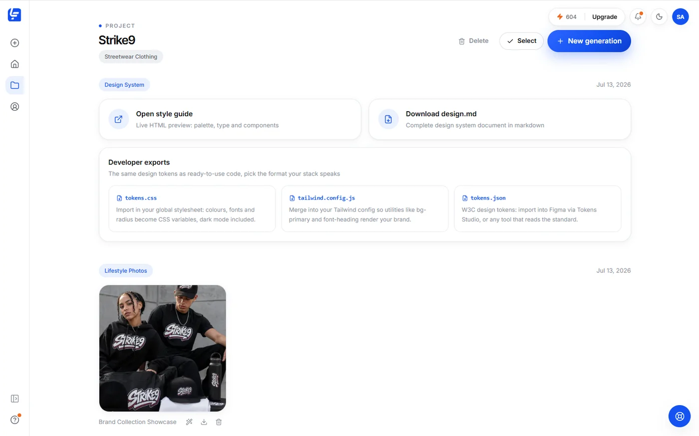
tokens.cssImport in your global stylesheet: colors, fonts and radius become CSS variables, dark mode included.
tailwind.config.jsMerge into your Tailwind config so utilities like bg-primary and font-heading render your brand.
tokens.jsonW3C design tokens: import into Figma via Tokens Studio, or any tool that reads the standard.
styleguide.htmlA live, shareable style guide rendering the whole system: palette, type, buttons, cards and forms.
How to use it. Three ways in.
Drop design.md in your repo root and mention it in your prompt, or add it to the project rules. Every component the agent writes uses your tokens instead of inventing its own.
Paste the file at the start of your first prompt: “Follow this design system”. Generated pages come out with your palette, fonts and button styles from the first render.
Send the file, or the live style guide link, as the design brief. Exact hex codes, sizes and states mean no guesswork and no “is this the right blue?” threads.
How it’s made. One screen, one minute.
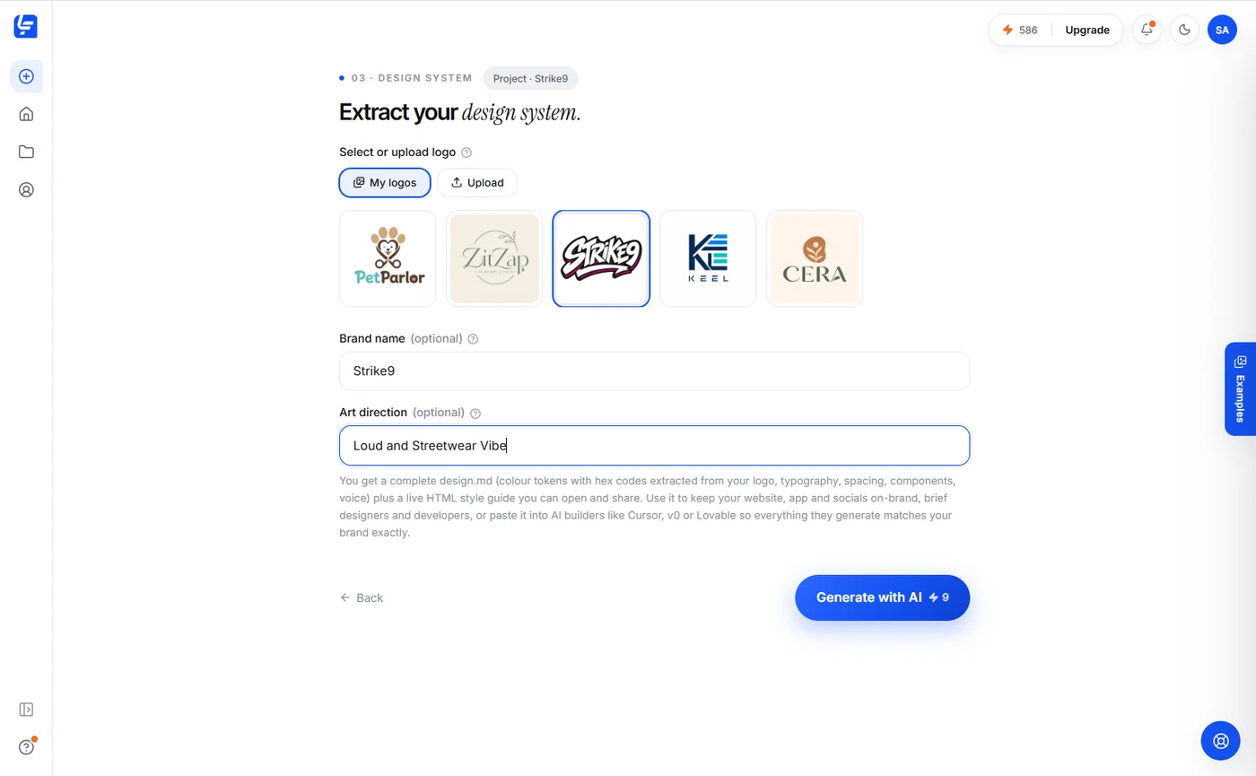
Pick a logo, optionally set a brand name and art direction, and generate. You get the file, the style guide and the developer exports together.
design.md, answered.
What is a design.md file?
A design.md is a markdown document that describes a design system in plain text: color tokens with hex codes, a typography scale, spacing and radius rules, component specs, motion, accessibility rules and brand voice. Because it is plain markdown, both humans and AI coding tools can read it.
Which tools can use a design.md?
Any AI coding tool that accepts context: Cursor, Claude Code, v0, Lovable, Bolt, Windsurf and similar. Paste the file into the project or the prompt, and generated UI follows your tokens, fonts and components. Human developers read it as a normal spec document.
How does Logofai generate it?
You pick or upload a logo, optionally add a brand name and art direction, and Logofai extracts the palette, pairs typography, and writes the complete file plus a live HTML style guide. It costs 9 credits and takes about a minute.
Can I edit the file afterwards?
Yes. It is plain markdown, so you can change any token or rule in any text editor. Most teams treat the generated file as the starting point and version it in their repo.
What else comes with it?
A live HTML style guide you can open and share, plus developer exports of the same tokens: tokens.css for stylesheets, tailwind.config.js for Tailwind projects, and tokens.json in the W3C design tokens format for Figma via Tokens Studio.
Which plans include design systems?
Design system generation is available on the Pro and Business plans. Every generation costs 9 credits, and failed runs refund automatically.
Your logo already contains a design system. Extract it.
9 credits. About a minute. design.md, live style guide and developer exports included.