


Logo font generator. No dropdown.
Worth saying before you read further: Logofai has no font picker. It does not set your business name in an existing typeface. It draws the letterforms as artwork, which is why a generated wordmark can do things no font can, and why you steer it with words rather than a list. Then, separately, the design system step names real fonts for everything around the logo. Two different jobs, and it helps to know which one you are doing.
A logo font generator works differently from a font picker. Instead of choosing a typeface from a menu, you describe the letterforms you want and the model draws them as original artwork. In Logofai this means naming three things in your prompt: a classification such as serif, script or sans-serif; a structure such as wordmark, monogram or lettermark; and a mood or era such as elegant, kinetic or art deco. The prompt “An elegant serif wordmark for a fine jewelry house, gold on black” is a complete brief. Named fonts arrive at a later step: the design system outputs a real Google Fonts pairing with a full type scale, for example Archivo Black for headings and Space Grotesk for body, which a developer or an AI coding tool can import directly.
Two stages. Drawn, then named.
Stage one: the letterforms are drawn. The mark is generated as artwork, so the letters can be stretched, cradled around an object, shaped into a skyline or given a stroke no released typeface has. That freedom is the whole point of a generated wordmark, and it is also why there is nothing to pick from a list. The trade-off is that you cannot ask for a specific commercial typeface by name, which is usually a licensing relief rather than a loss.
Stage two: real fonts get named. Once you have a mark you like, the design system reads it and pairs typography for everything else: headings, body, captions, with sizes, line-heights and weights. Those are real Google Fonts, named so a developer or a tool like Cursor can import them without asking. That is where the answer to “what font goes with my logo” actually lives.
People search for a logo font generator wanting stage one and needing stage two. A logo is maybe five per cent of the type on a finished brand. The other ninety-five is the website, the deck, the packaging and the emails, and that is the part a font pairing has to carry.
Eight real wordmarks. And the exact prompts.
Every mark below was generated with Logofai and is shown untouched, next to the exact prompt that produced it. The typographic instruction is called out on each one.
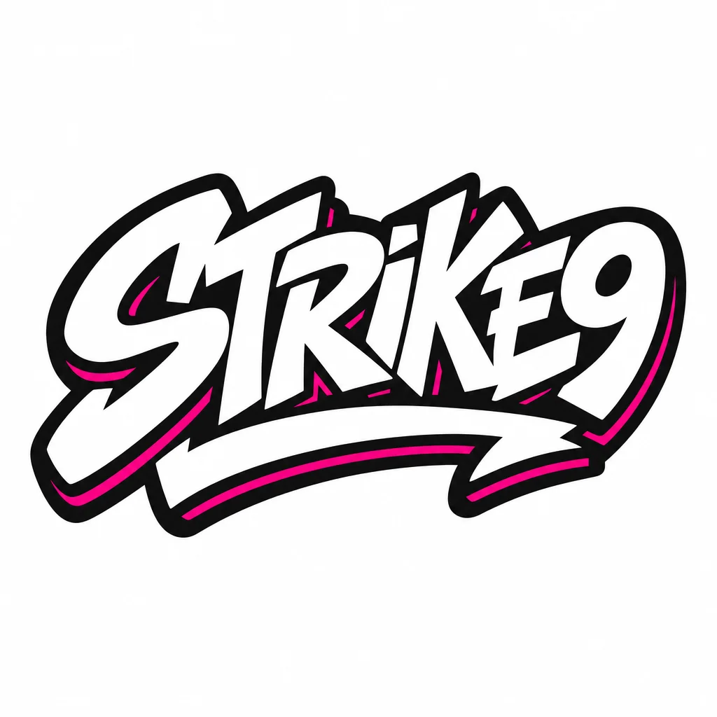
Typographic instruction: “graffiti script wordmark”
“A graffiti script wordmark for a streetwear label called Strike9, black, white and hot pink, loud and confident”
Script, but the aggressive kind. "Loud and confident" does more work here than any font name would.
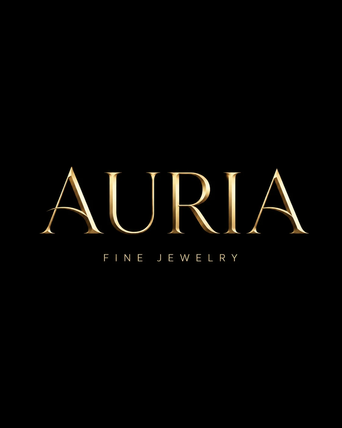
Typographic instruction: “elegant serif wordmark”
“An elegant serif wordmark for a fine jewelry house, gold on black”
Naming the classification, serif, plus one adjective and two colours was the whole brief.
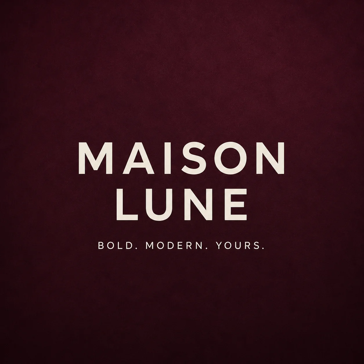
Typographic instruction: “editorial and Parisian”
“A luxury cosmetics wordmark, plum and blush, editorial and Parisian”
No classification at all. "Editorial" and "Parisian" carry enough typographic meaning on their own.
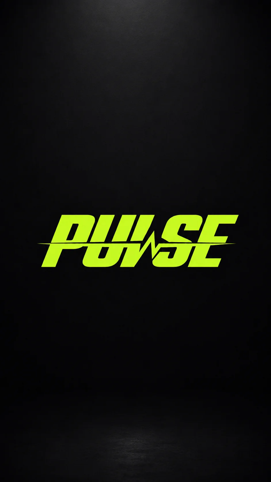
Typographic instruction: “kinetic wordmark”
“A kinetic wordmark for a gym, black and volt green, fast and loud”
A movement word rather than a style word. It shows up as slant and momentum in the letterforms.
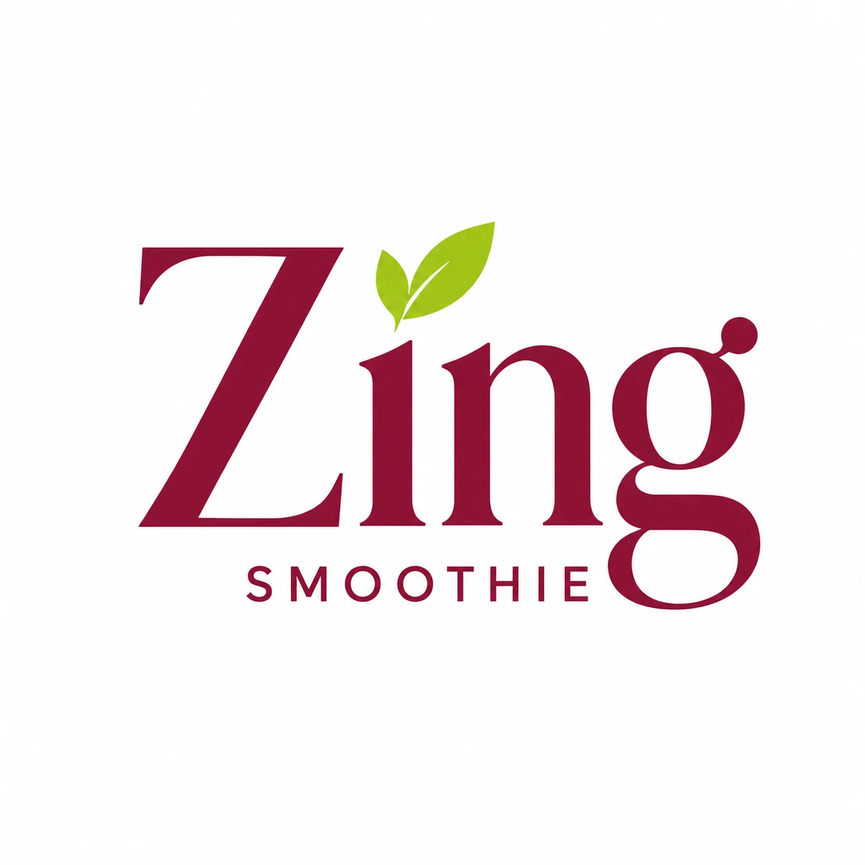
Typographic instruction: “playful serif”
“A fresh smoothie brand, berry burgundy and lime, playful serif”
Two words that pull against each other. Serifs usually read formal; "playful" is what stops that.
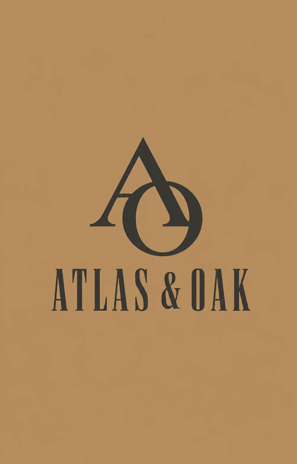
Typographic instruction: “heritage monogram”
“A heritage monogram for a leather goods brand, classic and crafted”
Monogram is a structural instruction, not a style one: it tells the model to build from initials.
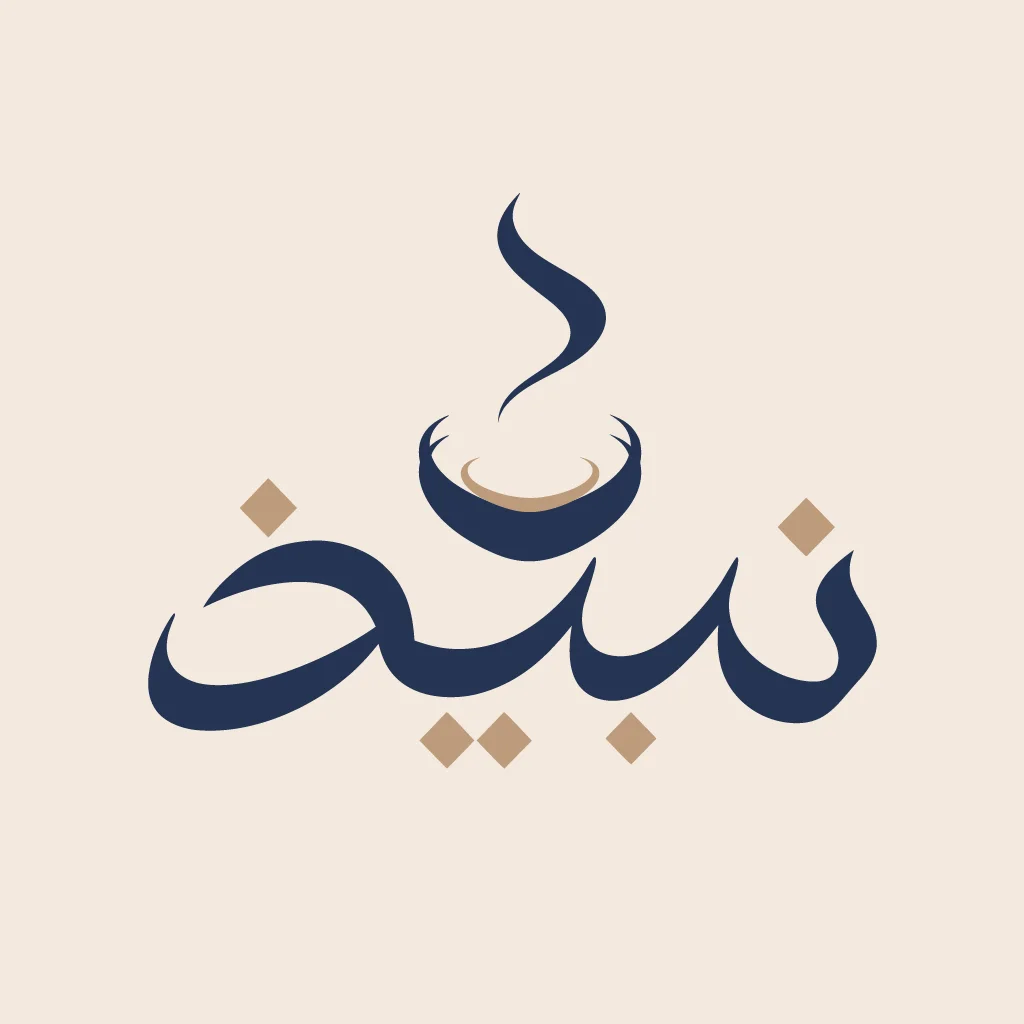
Typographic instruction: “Arabic calligraphy wordmark”
“An Arabic calligraphy wordmark for a Saudi cafe called Nabidh, the letters cradling a steaming coffee cup, deep navy and warm tan on cream”
Non-Latin scripts have their own traditions. Naming the script matters more than naming a mood.
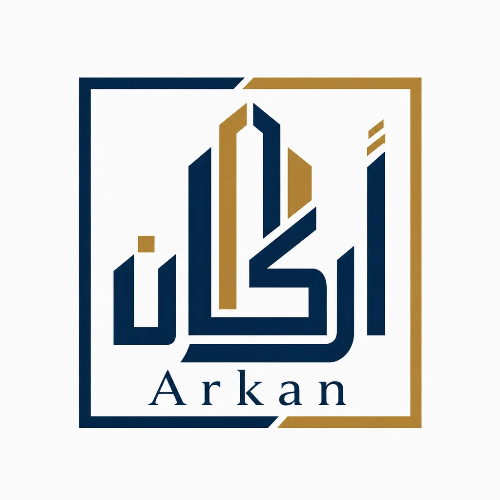
Typographic instruction: “Arabic calligraphy monogram”
“An Arabic calligraphy monogram for a premium real estate firm called Arkan, navy and gold, letters shaped like a skyline”
The letterforms are asked to become something else. Type as illustration rather than type as text.
All eight are from the use-case library, where each one is shown as a complete brand rather than a single mark.
The words that work. Six levers.
| Lever | Words to use | Why it works |
|---|---|---|
| Classification | serif, sans-serif, script, slab, monospace, blackletter | The broadest lever. If you only say one typographic thing, say this. |
| Structure | wordmark, monogram, lettermark, lockup, emblem | Tells the model what to build rather than how to style it. A monogram and a wordmark are different objects. |
| Weight and width | light, bold, heavy, condensed, extended | Weight reads as confidence and width reads as space. Condensed suits long names. |
| Era | art deco, seventies, retro, mid-century, futuristic, heritage | One era word replaces about five style words and is usually more reliable. |
| Mood | elegant, loud, calm, playful, clinical, crafted | Works best pinned to a classification. "Playful serif" is specific; "playful" alone is not. |
| Script | Arabic calligraphy, Devanagari, Cyrillic, CJK | Name the writing system explicitly. It changes the letterforms, not just the language. |
One classification, one structure and one mood is usually the sweet spot. Look at the prompts in the gallery above: none of them is long, and the two shortest, Auria and Zing, are among the most typographically distinct. Stacking six adjectives tends to average them out rather than combine them.
When something is close but not right, change one lever and regenerate rather than rewriting the whole prompt. Swapping “elegant” for “heritage”, or “serif” for “slab”, moves the result in a direction you can predict. Rewriting everything at once does not.
The fonts you actually get. A real example.
This is the typography section of the design.md Logofai generated for Strike9, the graffiti wordmark at the top of the gallery. It is reproduced exactly, not rewritten for this page. The mark itself is drawn artwork; everything below is the type system built around it.
| Level | Size / line-height | Family | Weight |
|---|---|---|---|
| Display | 56 / 1.05 | Archivo Black | 400 |
| H1 | 40 / 1.1 | Archivo Black | 400 |
| H2 | 30 / 1.15 | Archivo Black | 400 |
| H3 | 22 / 1.25 | Archivo Black | 400 |
| Lead | 19 / 1.55 | Space Grotesk | 500 |
| Body | 16 / 1.6 | Space Grotesk | 400 |
| Small | 14 / 1.5 | Space Grotesk | 400 |
| Caption | 12.5 / 1.4 | Space Grotesk | 500 |
Two things to notice. The families are named as Google Fonts, so a tool can import them without a decision. And the sizes are absolute numbers rather than “large” or “small”, because a relative word gets reinterpreted differently every time a model runs. The full design.md example shows the rest of the file, and design.md versus a style guide covers when you need the human-readable version as well.
Questions. Answered.
Can I choose the font for my logo?
Not from a list, no. Logofai draws the letterforms as artwork rather than setting your name in an existing typeface, so there is no font dropdown to pick from. You steer it with words instead: name the classification, the weight and the mood, and the mark comes back in that direction. Where you do get named fonts is the design system step, which outputs a real Google Fonts pairing with a full type scale for everything around the logo.
What fonts does Logofai use?
For the logo itself, none in the ordinary sense: the letterforms are generated as part of the artwork. For the brand around it, the design system names real Google Fonts so a developer or an AI coding tool can import them without asking. The Strike9 example on this page came back as Archivo Black for headings and Space Grotesk for body, with the sizes and weights shown in the table above. A different brand gets a different pairing.
How do I make a text logo or wordmark?
Say the word wordmark in your prompt, then give it one classification and one or two adjectives. "An elegant serif wordmark for a fine jewelry house, gold on black" produced the Auria mark above, and that is the entire prompt. Adding more adjectives usually makes the result vaguer rather than more precise, so change one thing at a time and refine from there.
Can I get the logo as a vector so the letterforms stay sharp?
Yes, SVG export is on the paid plans. It matters more for a typographic logo than most people expect, because thin serifs and fine script strokes are the first things to break when a raster file is scaled or printed. Our guide to logo file formats covers which file each supplier actually needs.
More on the craft: what makes a good logo, clear space and minimum size, and which logo file to send.
Describe the letters. See them drawn.
Or have your current wordmark scored on seven dimensions.