


Bar logos. Made for low light.
Bars get more personality in their branding than almost any other business, and they also face the strangest technical constraints. A bar mark has to work in neon, etched into glassware, foil-stamped on a coaster, chalked on a board, and lit from behind at night. Those are shape problems, not colour problems. Below are twelve real generated marks, ordered by how well they survive being reduced to a single flat colour, which is how customers will most often actually see them.
A bar logo is unusual because most of its applications remove colour entirely. Neon reduces a mark to a single continuous line, glass etching to one frosted tone, foil on a coaster to one metallic, and a backlit sign at night to a silhouette. That makes shape and line weight the deciding factors rather than palette. The most common choice in the category is to draw the drink: eleven of the twelve marks on this page show a glass, a bottle or a shaker. It reads instantly, and it also says only that drinks are served, which the word Bar beside it already said. The mark here that communicates most is the one that does not draw a drink at all, a microphone for a jazz bar, because it names the experience rather than the inventory. Palette should follow the sub-category rather than a rule: a late-night lounge earns deep green, oxblood or charcoal with brass, while a beach bar or a wine room can carry cream and warm light perfectly well. Whatever the colour, test the mark as a flat one-colour silhouette early, because anything built on a gradient will not survive the format it was made for.
Twelve marks. And how to ask for them.
Every mark below was generated with Logofai and is shown untouched. Each sits next to a prompt in the same direction, written to start from rather than the original text. Copy one, change the name to yours, and run it.
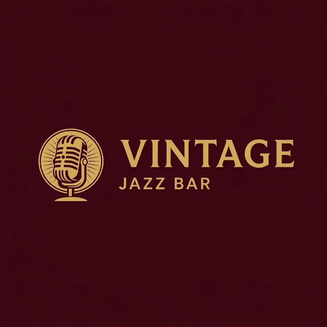
“A gold vintage broadcast microphone inside a fine ring for a jazz bar called Vintage, gold on deep burgundy, a letterspaced serif wordmark and the line jazz bar, warm and nostalgic”
The only mark here that does not draw a drink, and the one that tells you most about the room. It also survives the one-colour test intact.
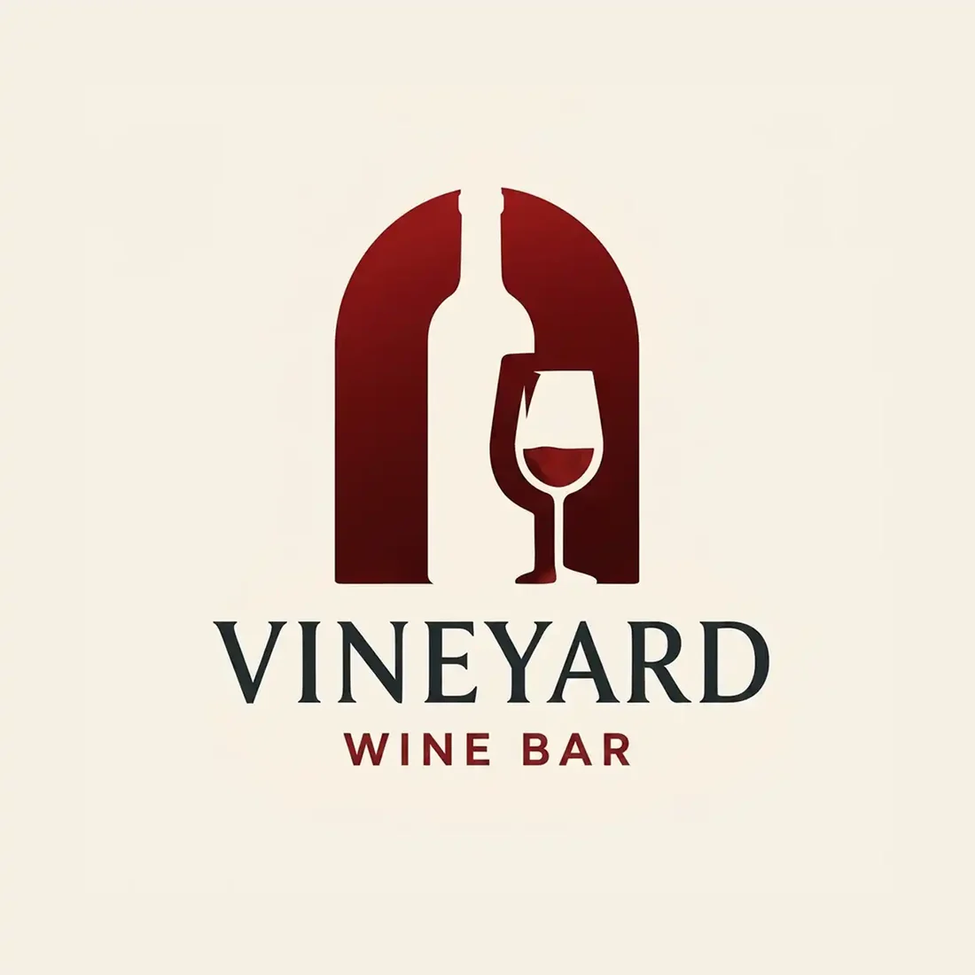
“A bottle and a wine glass forming an arched doorway in negative space for a wine bar called Vineyard, deep wine red on warm stone, a serif wordmark beneath”
The best idea in the set. The arch is made of the space between the bottle and the glass, so the mark reads as a room you walk into as well as what is served there.
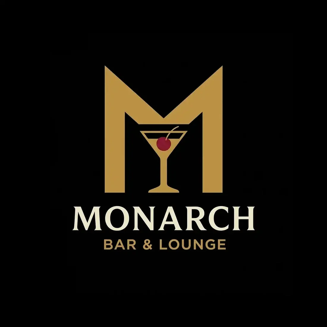
“A tall gold M with a martini glass built into its centre stroke for a cocktail lounge called Monarch, gold on black, a serif wordmark and the line bar and lounge”
The symbol is built out of the initial rather than parked beside it, the same move that works for a law firm monogram. Gold on black is the most confident pairing on the page.
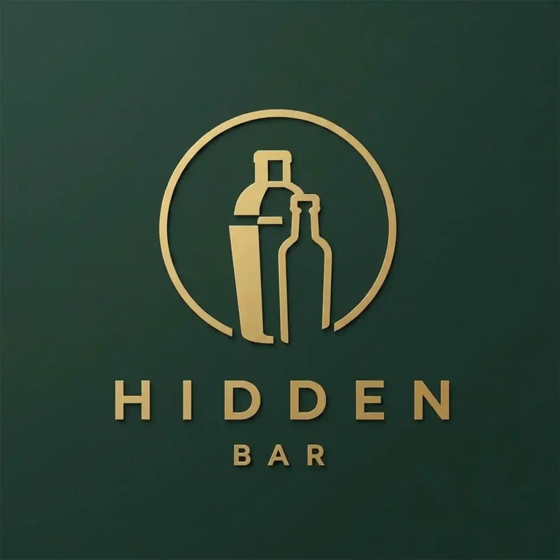
“A bottle and a cocktail shaker enclosed in a fine gold ring for a speakeasy called Hidden, gold on deep forest green, a widely letterspaced serif wordmark beneath”
The most convincing late-night room here. Deep green and brass is exactly the palette the category is named for, and the circle crops cleanly to an avatar.
“A single-stroke line-art martini glass with an olive pick for a cocktail bar called Mixed, dark wine red on white, a widely letterspaced sans wordmark beneath”
The most neon-ready mark on the page. It is already one continuous line of even weight, so it would bend into tube almost unchanged.
“A citrus slice and a leaf built into a line-art glass for a cocktail bar called Citrus, deep green on cream, a letterspaced serif wordmark beneath”
Fresh rather than nocturnal, and the linework is light enough to etch. The fine interior lines are the part that will close up at coaster size.
“A beer glass with a foam head inside a solid shield for a tap room called Taphouse, black on warm amber, a bold letterspaced sans wordmark and the line bar and bites”
Heavy, flat and completely unambiguous. The shield gives it a container that works as a badge, a tap handle and an avatar without redrawing.
“A wine bottle and glass silhouetted on a purple gradient circle for a wine bar called Vinum, aubergine and violet on cream, a letterspaced serif wordmark beneath”
The silhouettes hold up in one colour, but the purple gradient behind them is decorative rather than structural, so nothing is lost by flattening it.
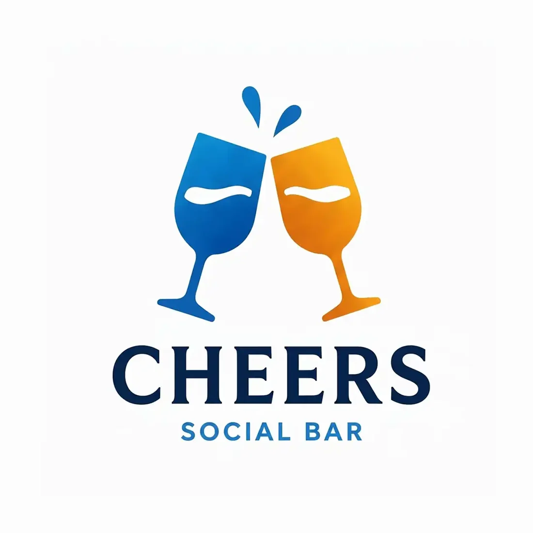
“Two clinking glasses in blue and amber with a splash above for a social bar called Cheers, blue and amber on white, a bold serif wordmark and the line social bar”
Cheerful at full size. In one colour the two glasses merge into a single blob, because the only thing separating them was the colour change.
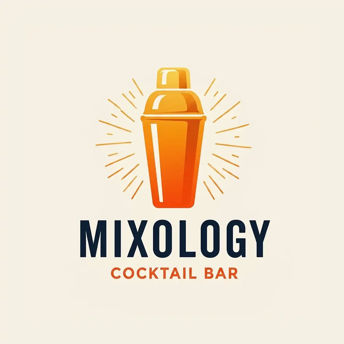
“An orange cocktail shaker with fine rays radiating outward for a cocktail bar called Mixology, orange on cream, a heavy sans wordmark and the line cocktail bar”
The rays are the personality and they are the first thing to go: at one colour and at small sizes they disappear and the shaker turns into a shapeless mass.
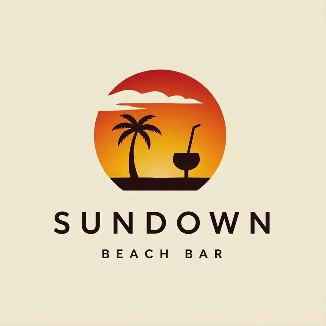
“A palm tree and a cocktail against a setting sun in a gradient circle for a beach bar called Sundown, orange and red on cream, a letterspaced sans wordmark beneath”
The sunset is the whole idea and it is made entirely of a gradient, so flattening it removes the sun and leaves a palm tree floating in a void.
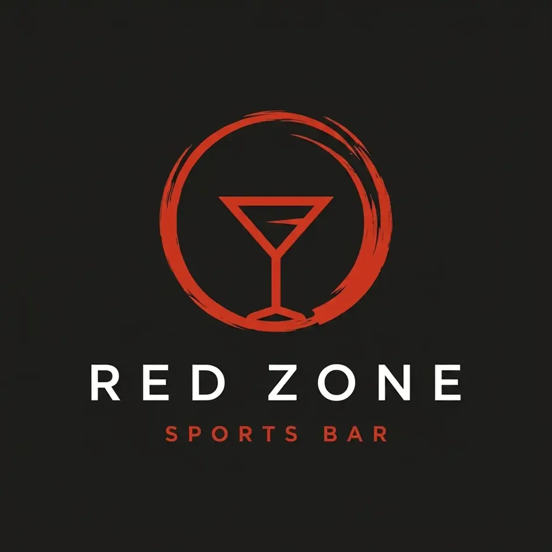
“A martini glass inside a rough red brushed ring for a sports bar called Red Zone, red on charcoal, a bold letterspaced sans wordmark and the line sports bar”
The weakest under the test: reduced to one colour the glass and the ring vanish completely and only the wordmark is left. A martini glass is also an odd fit for a sports bar.
What actually decides it. Four things.
Eleven of the twelve marks above show a glass, a bottle or a shaker. It is the reflex of the category, it is instantly legible, and it is also the least informative thing a bar logo can say, because every bar serves drinks. Look at what happens when one does not: Vintage uses a microphone and immediately tells you it is a jazz bar, which is a real reason to walk in. Sundown gets close with a palm and a sunset. The question worth asking is not what you serve, it is what the room feels like at nine in the evening.
Every mark on this page was reduced to a hard one-colour silhouette, and the results split cleanly. Vintage, Vineyard, Monarch, Hidden, Mixed, Citrus, Taphouse and Vinum all survive intact. Cheers collapses into a single blob because the two glasses are separated only by colour. Mixology loses its radiating rays. Sundown loses the entire sunset, which was the idea. Red Zone loses the glass and the ring completely, leaving nothing but the words. That is exactly what a neon sign, an etched glass and a foil coaster will each do to them.
The strongest thing this set does is refuse to be generically a bar. Jazz bar, sports bar, beach bar, wine bar, cocktail bar, bar and lounge, bar and bites: each one commits to a venue, and the marks that commit hardest are the ones you could pick out of a street of twenty signs. Vineyard builds a bottle and a glass into an arched doorway, which reads as a wine room before you have read a word of it.
Bar branding is usually seen in low light, which is why deep green, oxblood, charcoal and midnight blue with brass or amber are the reliable choices, and Hidden, Monarch and Vintage all show why. But a rule is not a law. Sundown on warm cream is right for a beach bar, and Vineyard on stone is right for a wine room, because neither of those venues is a dark room at midnight. Decide what time of day your business actually happens, then pick the ground.
Where it has to work. The real formats.
| Where | What it demands |
|---|---|
| Neon or faux-neon sign | One continuous line of even weight. No fills, no gradients, no fine interior detail. |
| Etched or printed glassware | A single frosted tone, curved surface, small. |
| Foil-stamped coaster | One metallic colour, and foil needs generous stroke weight. |
| Chalkboard and menu | Often hand-redrawn, so the shape has to be simple enough to copy. |
| Backlit exterior sign at night | Read as a silhouette from across the street. |
Every one of these is a variation, not a resize. Logo System produces each arrangement from one approved mark, with the computed minimum size and clear space, and this guide explains why those numbers matter.
Questions. Answered.
What makes a good bar logo?
A shape that survives having its colour taken away. Neon reduces a mark to one line, glass etching to one frosted tone, foil on a coaster to one metallic, and a lit sign at night to a silhouette, and those are the formats customers actually encounter. Reduce your mark to a flat one colour before you sign it off. On this page that single test separates the eight marks that hold together from the four that fall apart, and the four that fail are all the ones whose idea lived in a gradient.
Should a bar logo show a glass or a bottle?
It is the obvious choice and eleven of the twelve marks here make it, which tells you how little it distinguishes anyone. A glass says drinks are served, and the word Bar beside it already said that. The more useful question is what your room is: a jazz bar, a sports bar, a wine room, a beach shack. Vintage on this page uses a microphone instead of a glass and communicates more in one symbol than any of the cocktail glasses manage, because it names the evening rather than the inventory.
What colours work for a bar logo?
For a late-night room, deep green, oxblood, midnight blue and charcoal with brass, copper or amber, because bar branding is seen in low light where pale tints and low-contrast pairings vanish. But match the palette to the venue rather than the category. A beach bar in daylight and a wine room at lunchtime are not dark rooms, and cream or stone serves them better. Whatever you choose, check it in one flat colour, because that is what neon, etching and foil will each reduce it to.
More industries: law firms, contractors, consulting firms, accountants.
Your name, your prompt.
Or have your current logo scored on seven dimensions.