


Contractor logos. Built to survive.
A contractor logo has a harder physical life than almost any other kind of mark. It gets read at sixty miles an hour off a truck door, stitched into hi-vis, screen printed on a hard hat, and staked in a front yard where it has to work at a hundred feet. Below are twelve real generated marks, including a few that show exactly how a good-looking logo can still be the wrong logo, and the two constraints that decide which ones hold up.
A contractor logo is judged on two things above all: whether it names the right trade, and whether it survives one-colour reproduction at distance. The trade point is the one most often missed, because a symbol that reads as painting, landscaping or handyman repair will quietly cost a general contractor the enquiry before anyone reads the name. The reproduction point is physical: a truck door read at speed, a yard sign read at roughly a hundred feet, embroidery on workwear that cannot hold a line thinner than about a millimetre, and a hard hat sticker a few centimetres wide. Heavy stroke weight, wide letter spacing and no fine interior detail are what survive that. Safety orange, hi-vis yellow and strong red hold contrast in daylight better than anything else, which is why the category leans on them, though gold and blue are common when a firm wants a more premium read. Gold in particular is usually delivered as a gradient, and a gradient is the first thing to disappear when a mark is embroidered, stamped or stencilled.
Twelve marks. And how to ask for them.
Every mark below was generated with Logofai and is shown untouched. Each sits next to a prompt in the same direction, written to start from rather than the original text. Copy one, change the name to yours, and run it.
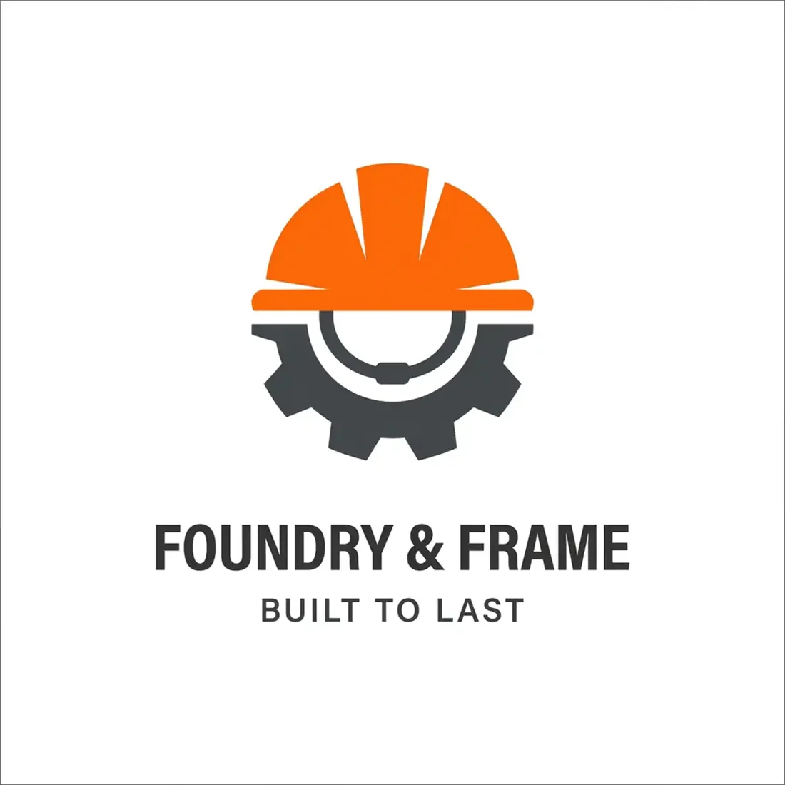
“An orange hard hat sitting over a dark gear for a general contractor called Foundry & Frame, safety orange and charcoal, a bold sans wordmark and the tagline built to last, direct and industrial”
The strongest mark here for the actual job. Two heavy shapes, a genuine safety colour, and it would still read at a hundred feet with the colour removed.
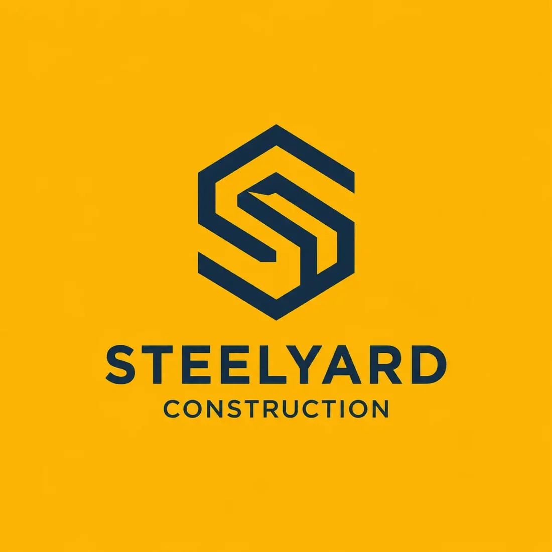
“A heavy hexagonal S monogram for a steel contractor called Steelyard Construction, deep navy on amber, angular and structural, a bold sans wordmark beneath”
The only pure monogram in the set. Thick strokes and a closed shape mean it survives being stitched into a cap, which almost nothing else here would.
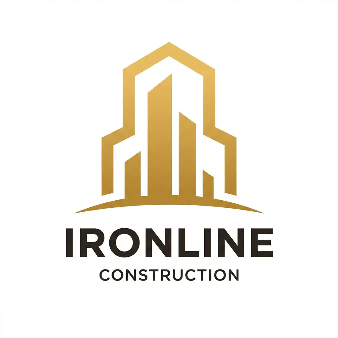
“A gold gradient skyscraper cluster above a fine ground line for a construction firm called Ironline Construction, gold and near-black on white, a clean sans wordmark beneath, corporate and precise”
Reads as commercial developer rather than trade contractor, which may be exactly right depending on who you invoice. The thin window slots are the part that will close up in embroidery.
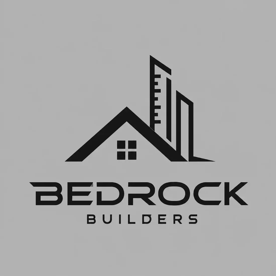
“A roofline joined to a building silhouette with a fine measurement rule for a foundations contractor called Bedrock Builders, solid black on concrete grey, a heavy letterspaced sans wordmark beneath”
Flat, one colour, no gradient. Unfashionable and by far the most reproducible mark on this page.
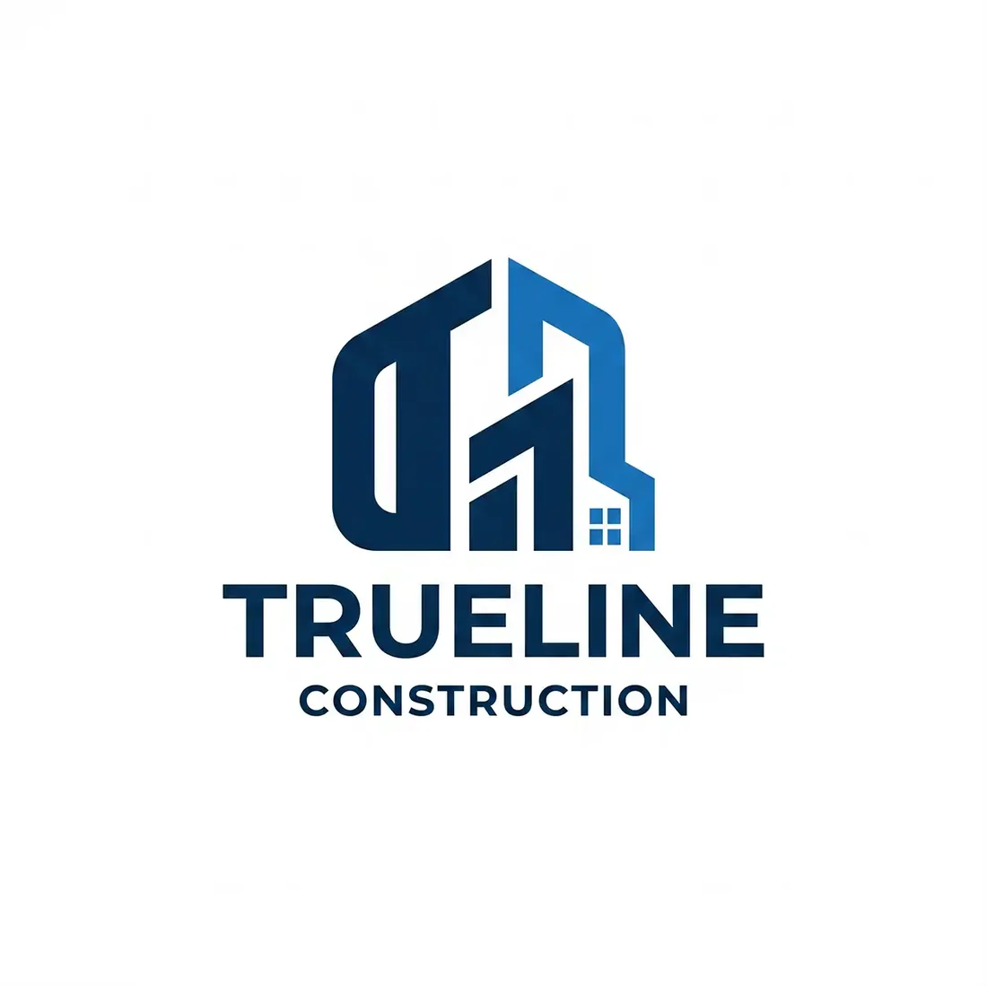
“Geometric blue building forms suggesting the letters T and L for a construction company called Trueline Construction, cobalt and mid blue on white, a bold sans wordmark beneath, precise and modern”
The letterforms hiding in the buildings are the good idea here. Blue is a softer read than a safety colour, so it trades some distance legibility for a more corporate tone.
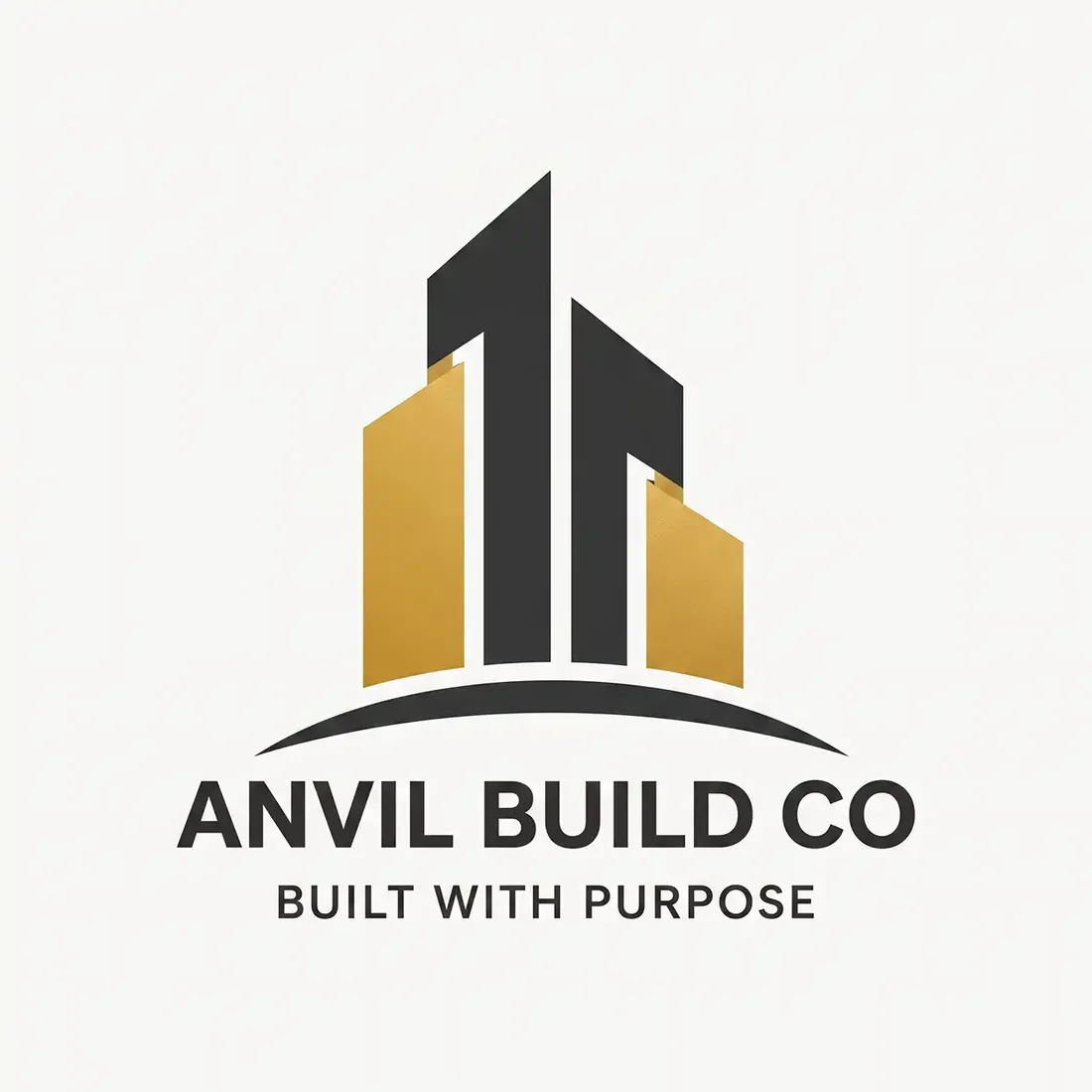
“Angular gold and charcoal towers above a curved ground line for a builder called Anvil Build Co, gold gradient and dark grey on off-white, a bold sans wordmark and the tagline built with purpose”
Nothing here says anvil. Worth knowing when a name promises a specific image and the mark does not deliver it, because the name then has to do all the work alone.
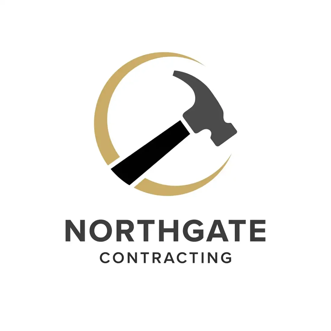
“A claw hammer set inside an open gold circle for a construction company called Northgate Contracting, gold and black on white, a letterspaced sans wordmark beneath, classic and clear”
The hammer is the most generic symbol available to the trade, but the circle gives it a container that crops well to an avatar. The claw detail is finer than embroidery will hold.
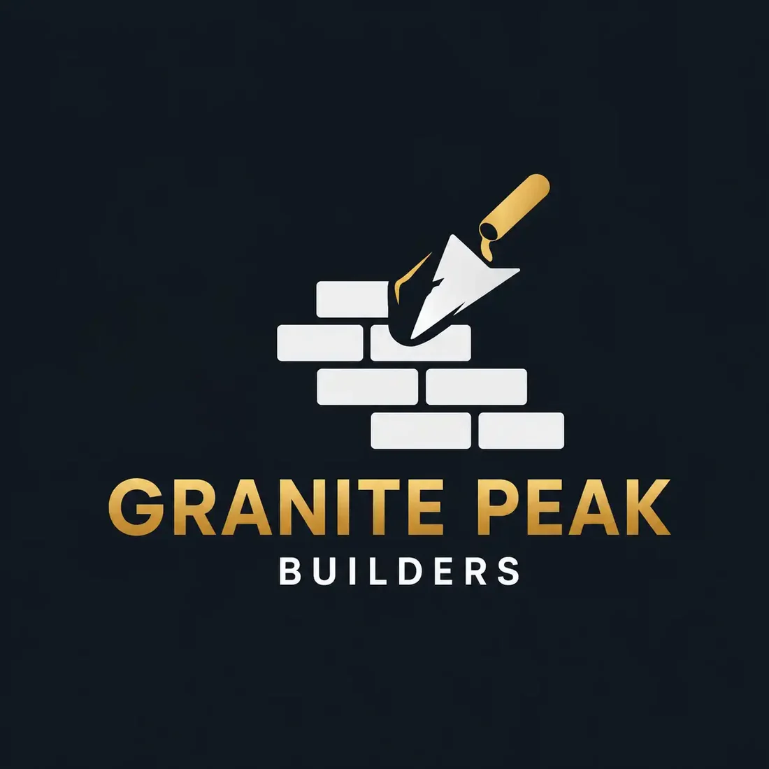
“A gold trowel laying a course of white bricks for a masonry contractor called Granite Peak Builders, gold and white on near-black, a bold sans wordmark beneath”
Specific and legible about the trade, which is the right instinct. The individual bricks are the risk: at hard hat sticker size they merge into one block.
“A gold roofline containing an interlocking hexagon for a construction firm called Redhawk Builders, gold on white, a heavy letterspaced sans wordmark beneath”
A second idea inside the roof outline, which is how you escape the most common device in the category. No hawk though, so the name is unsupported by the mark.
“A white house outline with a wrench cut into the lower half for a contractor called Summit Grade, white on deep navy, a bold sans wordmark and the tagline raising standards”
Cleanly drawn and confidently set. The wrench says handyman repair, so an excavation and grading firm would be advertising the wrong service every time the truck drives past.
“A white house outline wrapped by a leaf for a contractor called Highmark Contracting, white on bright cornflower blue, an elegant serif wordmark beneath”
The most attractive mark on the page and the most misleading. The leaf reads as landscaping or eco retrofit, and the serif wordmark reads residential architecture, neither of which is roofing.
“A blue house outline with a green paint roller across it for a contractor called Cobalt Build, blue and green on white, a bold sans wordmark and the tagline built on trust”
A painter and decorator’s logo. If that is the business, it is a good mark; if it is a general contractor, every enquiry it attracts is the wrong one.
What actually decides it. Four things.
This is the failure that costs real money, and there are three examples of it in the gallery above. Cobalt Build is a general contractor carrying a paint roller, which reads as a decorator. Highmark is a roofing contractor carrying a leaf, which reads as landscaping or eco retrofit. Summit Grade does excavation and grading and carries a wrench, which reads as handyman repair. All three are competently drawn and all three point at the wrong business. A homeowner scanning a yard sign gives you about three seconds, and the symbol spends them before the name does.
Most contractors get more impressions from vehicle livery than from every other channel combined, and the viewing conditions are terrible: moving, angled, sunlit, three seconds. That is the format to design for. Foundry & Frame and Steelyard hold up there because they are built from two or three heavy shapes and nothing else. If a mark works on a truck door it works everywhere; the reverse is not true.
Five of the marks above are built on a gold gradient, and gold gradients photograph beautifully and reproduce badly. Embroidery has a thread count, not a ramp. A hard hat sticker, a stencil, a stamped invoice and a one-colour permit board all flatten a gradient to a single tone, and a mark whose depth came entirely from that ramp goes flat with it. If you want the premium read that gold gives, commit to a flat metallic and check it as a silhouette before you sign it off.
Five of these twelve are a house or roof outline, which is the single most used device in contractor branding. It is legible and it is honest, and it is also what every competitor in the local pack has. If you use it, the differentiation has to come from somewhere else: the weight, the palette, or a second idea inside the outline the way Redhawk builds a hexagon into its roofline.
Where it has to work. The real formats.
| Where | What it demands |
|---|---|
| Truck door and vehicle wrap | Read at speed and at an angle. Needs heavy weight and wide spacing. |
| Yard sign | Legible at roughly 100 feet. The name has to dominate; detail is wasted. |
| Embroidery on hi-vis and caps | No line thinner than about 1mm at final size, and no gradients at all. |
| Hard hat sticker | A few centimetres wide, one or two flat colours, curved surface. |
| Invoices, permits and stamps | Flat black on white, often photocopied or scanned. |
Every one of these is a variation, not a resize. Logo System produces each arrangement from one approved mark, with the computed minimum size and clear space, and this guide explains why those numbers matter.
Questions. Answered.
What makes a good contractor logo?
Two things, and the first is the one people skip. The symbol has to name the right trade: a paint roller, a leaf or a wrench will each attract a different customer than a general contractor wants, no matter how well drawn it is. The second is physical survival. The mark has to hold up on a moving truck door, on a yard sign at a hundred feet, stitched into a cap and printed one-colour on a hard hat sticker. That rules out thin strokes, small interior detail and gradients. If the name is readable at a glance and the shape still reads with all the colour removed, most of the job is done.
Should a contractor logo show tools or buildings?
Usually yes, and this is one of the few categories where the literal option beats the abstract one, because a homeowner scanning a yard sign has about three seconds. The catch is that the tool has to be your tool. A hammer says construction generally, a trowel says masonry, a paint roller says decorating, a wrench says repair. Pick the one that matches what you actually invoice for, and be aware that the house or roof outline, while perfectly good, is also what most of your local competitors are using.
What colours work best for a construction logo?
High-visibility orange, safety yellow and strong red paired with black, charcoal or navy hold their contrast in daylight at distance better than anything else, which is the condition your signage and vehicles are actually read in. Gold and blue are common when a firm wants a more premium or corporate read, and they work, but they give up some distance legibility to get it. If you go gold, use a flat metallic rather than a gradient, because embroidery, stencils and stamps have no way to reproduce a ramp.
More industries: law firms, consulting firms, accountants, bars.
Your name, your prompt.
Or have your current logo scored on seven dimensions.