
Consulting logos. Without the cliché.
Consulting has the least constrained branding of any category here, which is precisely the problem. With no physical limits forcing decisions, most advisory firms converge on the same abstract geometry in the same corporate blue and end up indistinguishable from the firm they are pitching against. Below are twelve real generated marks, only two of which are blue, and what that choice is worth.
A consulting firm logo has almost no physical constraints, so its real risk is sameness rather than illegibility. The category converges on abstract geometry in corporate blue, which means a mark can be competently made and still say nothing specific. Colour is where most of the available differentiation sits: in the gallery on this page, only two of twelve marks are conventional navy, and the ones that register fastest are the pink, the forest green, the brown and gold, and the black on yellow. The structures that work are a geometric lettermark built from the firm’s initial, a single abstract symbol that means one thing rather than gesturing at growth and synergy and partnership at once, and a confident wordmark. Two symbols to think twice about are the rising bar chart and the upward arrow, which are to consulting what the scales of justice are to law: instantly legible, and equally available to every competitor. The formats that actually judge the mark are a pitch deck title slide, a proposal cover printed in black and white, an email signature, and a LinkedIn avatar cropped to a circle.
Twelve marks. And how to ask for them.
Every mark below was generated with Logofai and is shown untouched. Each sits next to a prompt in the same direction, written to start from rather than the original text. Copy one, change the name to yours, and run it.
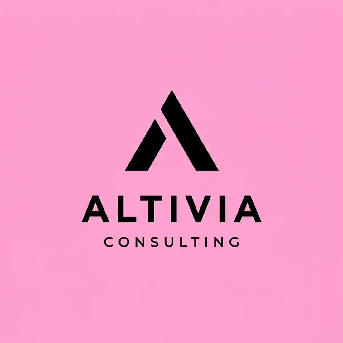
“A solid black angular A forming a peak for a consulting firm called Altivia Consulting, black on hot pink, a heavy letterspaced sans wordmark beneath, bold and modern”
The most memorable mark here, and the boldest colour decision in the set. Heavy enough that it still reads as an A at avatar size.
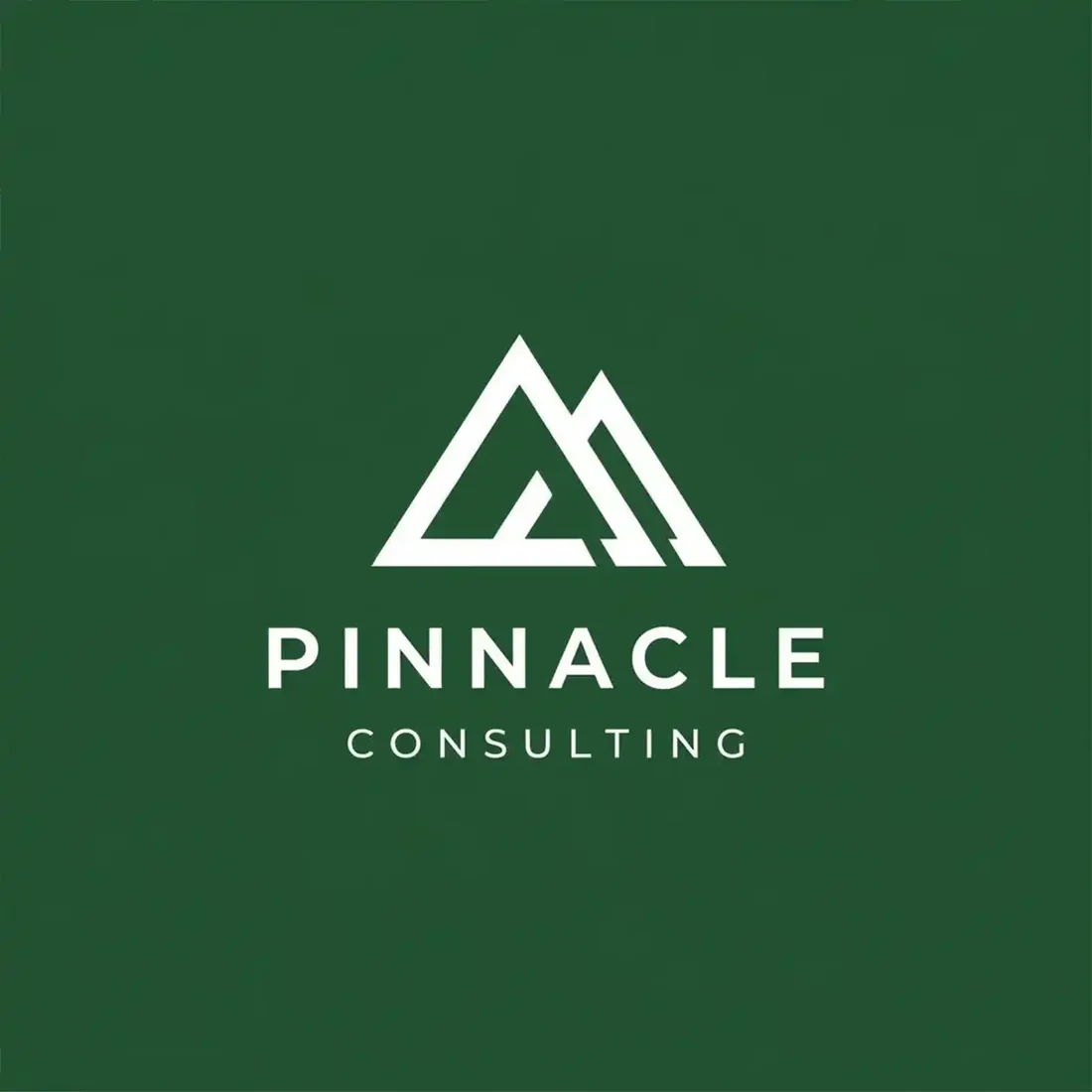
“A line-drawn mountain range built from overlapping triangles for a consultancy called Pinnacle Consulting, white on deep forest green, a letterspaced sans wordmark beneath, calm and assured”
The symbol names the firm rather than the industry, and forest green does more to separate it from competitors than any change of shape would.
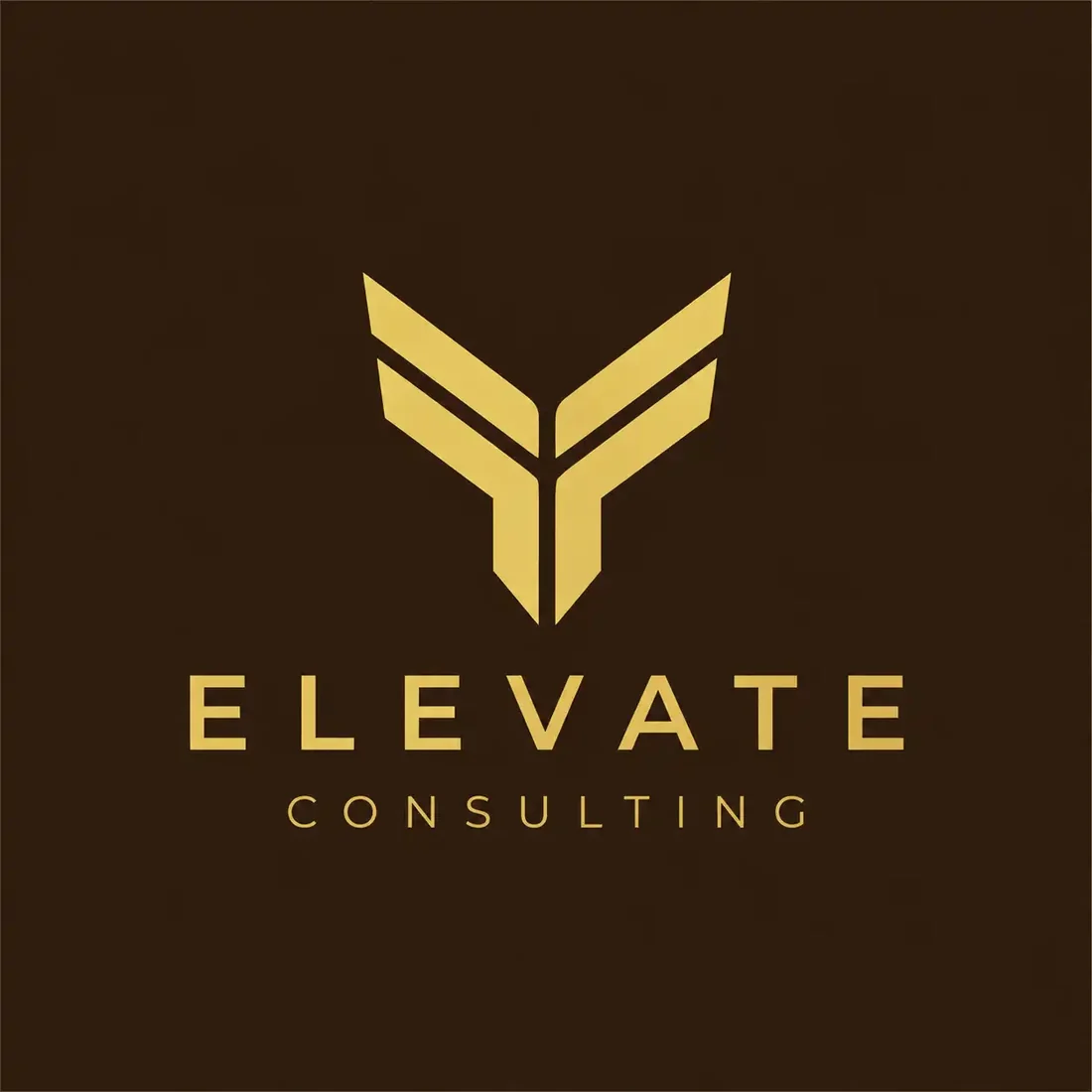
“A gold chevron pair forming an upward Y for a consulting firm called Elevate Consulting, gold on dark chocolate brown, a widely letterspaced sans wordmark beneath, premium and directional”
Brown and gold is a genuinely unusual choice for advisory work and reads as expensive rather than corporate.
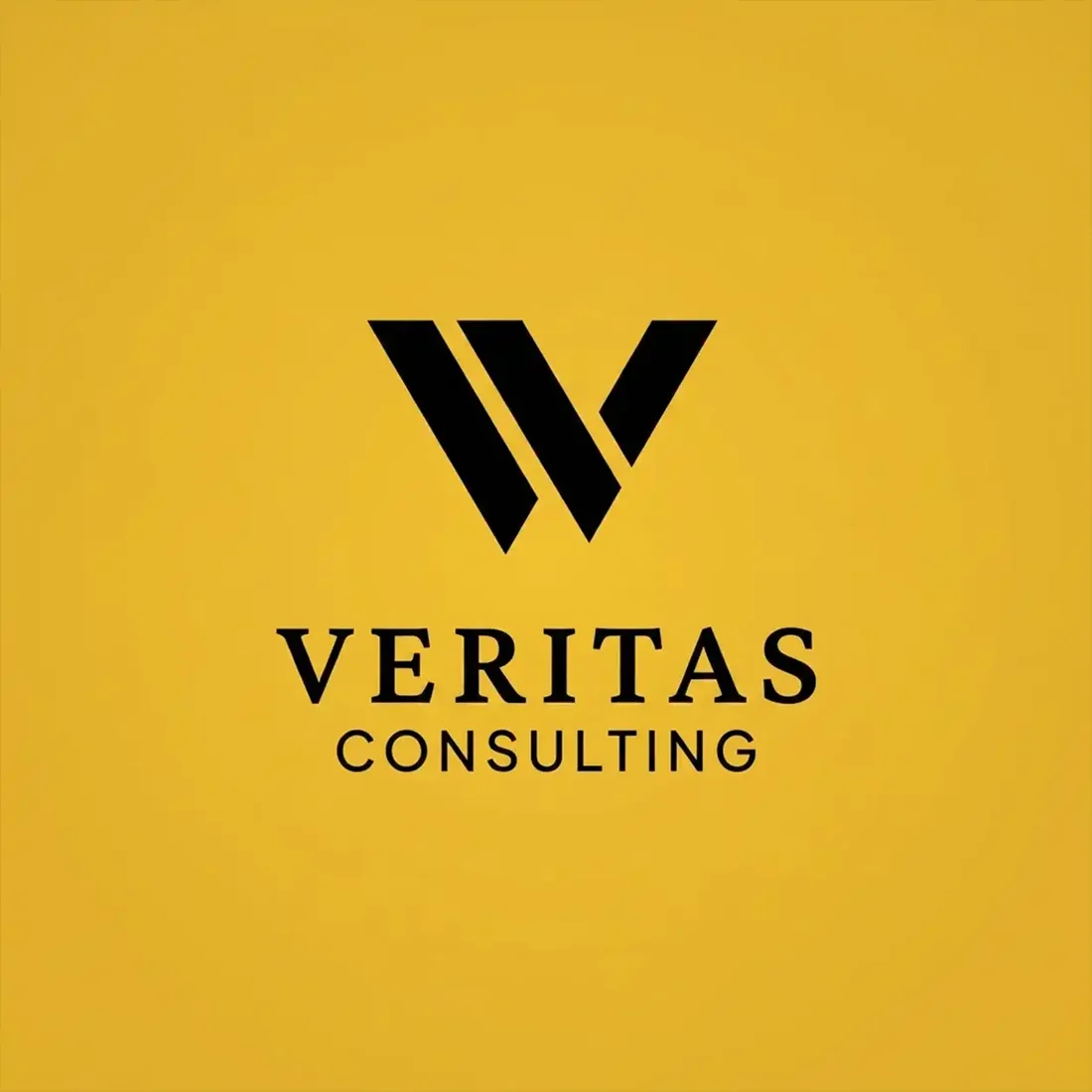
“A heavy black W formed from two overlapping V shapes for a consultancy called Veritas Consulting, black on golden yellow, a bold serif wordmark beneath, confident and graphic”
The highest contrast pairing in the set, so it survives small sizes and bad projectors better than anything else here.
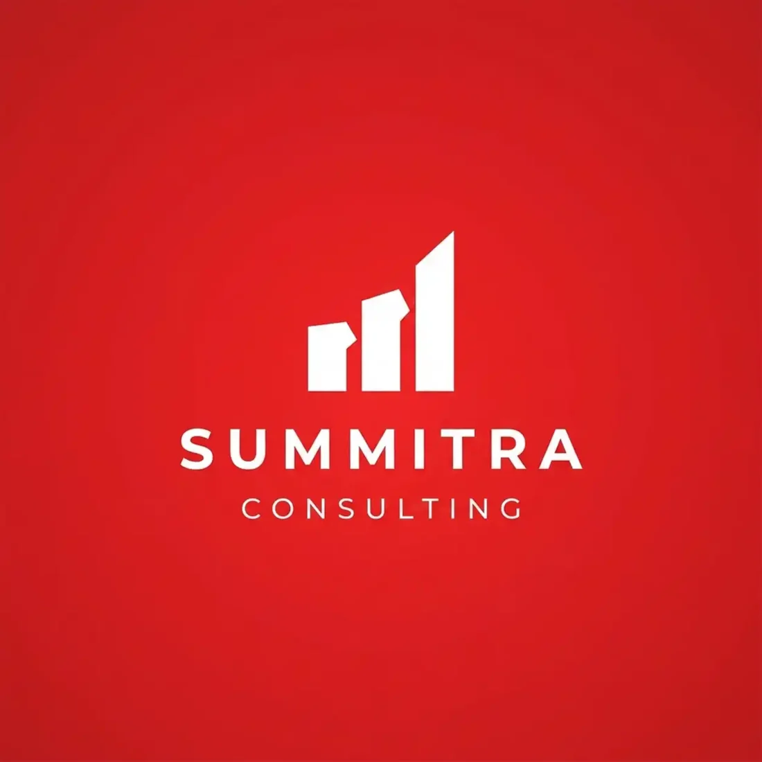
“Ascending white bars with a rounded cap for a consulting firm called Summitra Consulting, white on deep red, a heavy letterspaced sans wordmark beneath, energetic and direct”
Red is rare in advisory branding and worth the boldness. The bars are the generic part, not the palette.
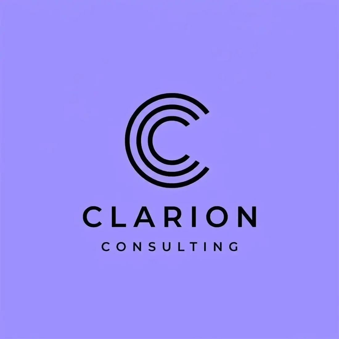
“A C drawn as concentric expanding rings for a consulting firm called Clarion Consulting, near-black on periwinkle lavender, a letterspaced sans wordmark beneath, distinctive and calm”
A lovely idea at full size. The concentric rings merge into a smudge below about 48 pixels, so this one needs a simplified avatar variant.
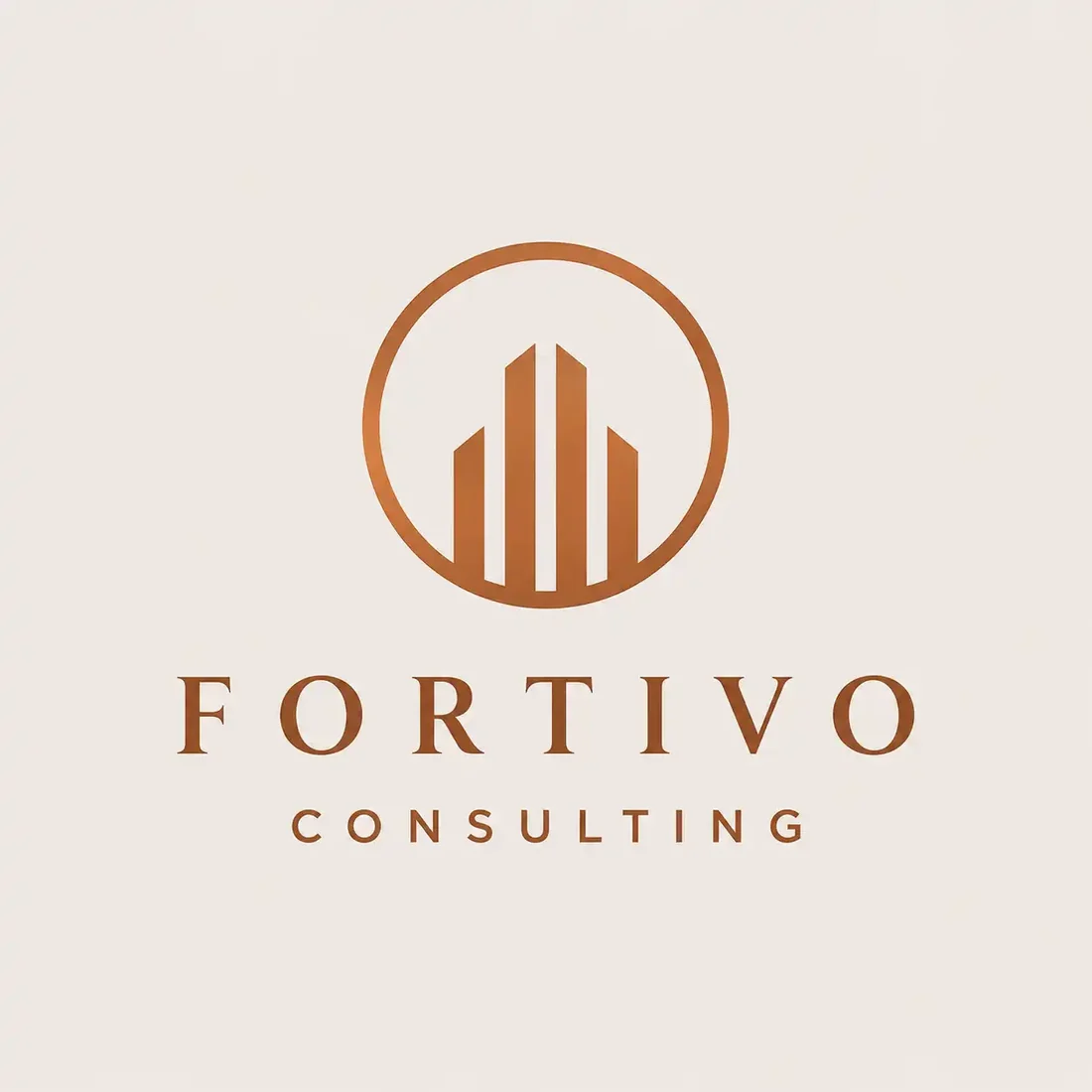
“Rising copper bars enclosed in a thin circle for a consulting firm called Fortivo Consulting, copper on warm cream, a letterspaced serif wordmark beneath, refined and traditional”
The warm neutral palette is doing well; the bar chart inside is the most borrowed symbol in the category, and the hairline circle is the first thing to vanish when printed small.
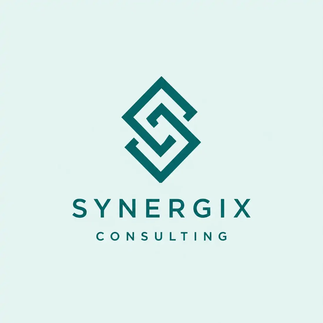
“An interlocking S set inside a diamond outline for a consulting firm called Synergix Consulting, teal on pale mint, a letterspaced sans wordmark beneath, geometric and cool”
Cleanly built, but teal on pale mint is the lowest contrast pairing in the set, and the name is doing the thing this page warns about.
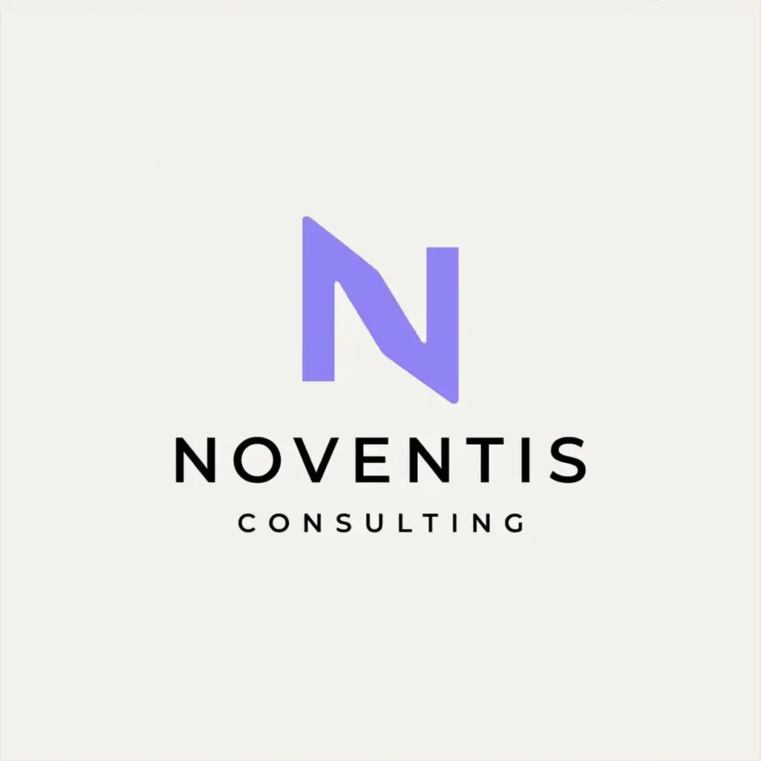
“A geometric N split between violet and deep navy for a consultancy called Noventis Consulting, on soft off-white, a letterspaced sans wordmark beneath, precise and contemporary”
A single letter, one idea, no decoration. The violet keeps it from reading as another navy consultancy.
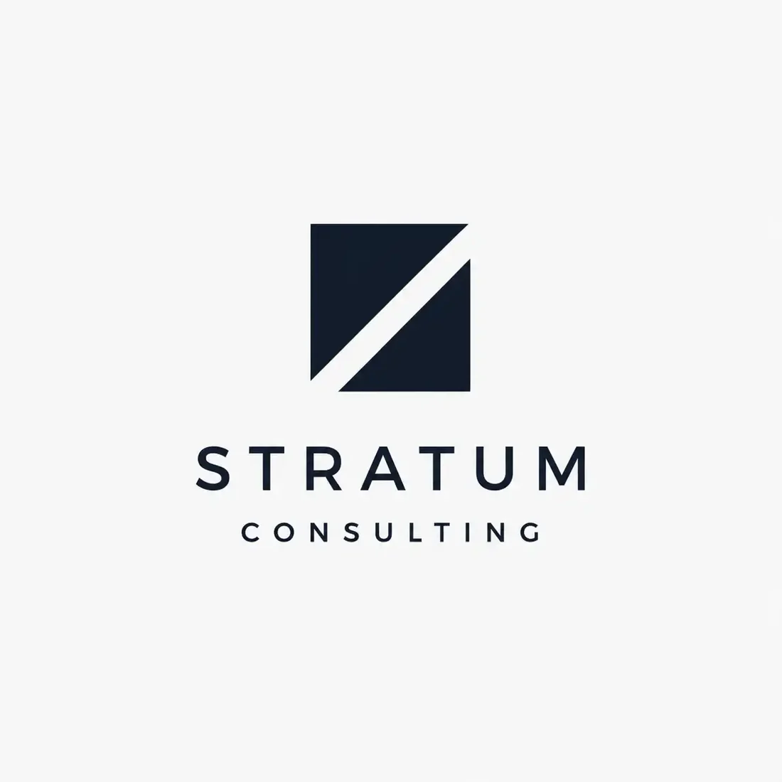
“A near-black square divided by a diagonal white band for a consulting firm called Stratum Consulting, on white, a widely letterspaced sans wordmark beneath, minimal and severe”
The most reduced mark here. It commits to one idea and prints perfectly in black and white, which is more than most of this page can claim.
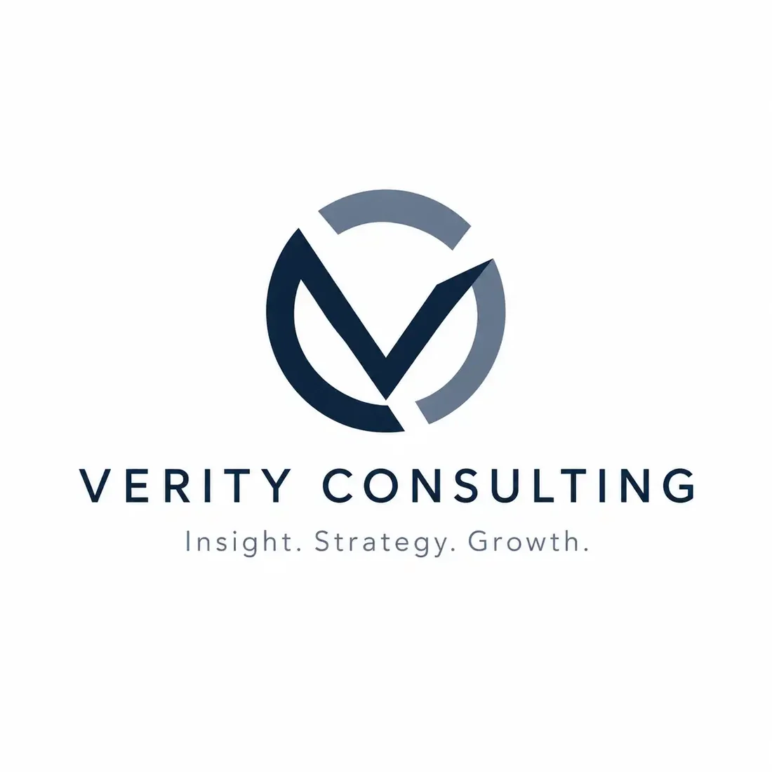
“A V inside a broken circle in navy and slate for a consultancy called Verity Consulting, on white, a letterspaced sans wordmark and the tagline insight strategy growth”
Competent and completely conventional. Placed next to Veritas above, it also shows how easily two advisory names built on the same root become hard to tell apart.
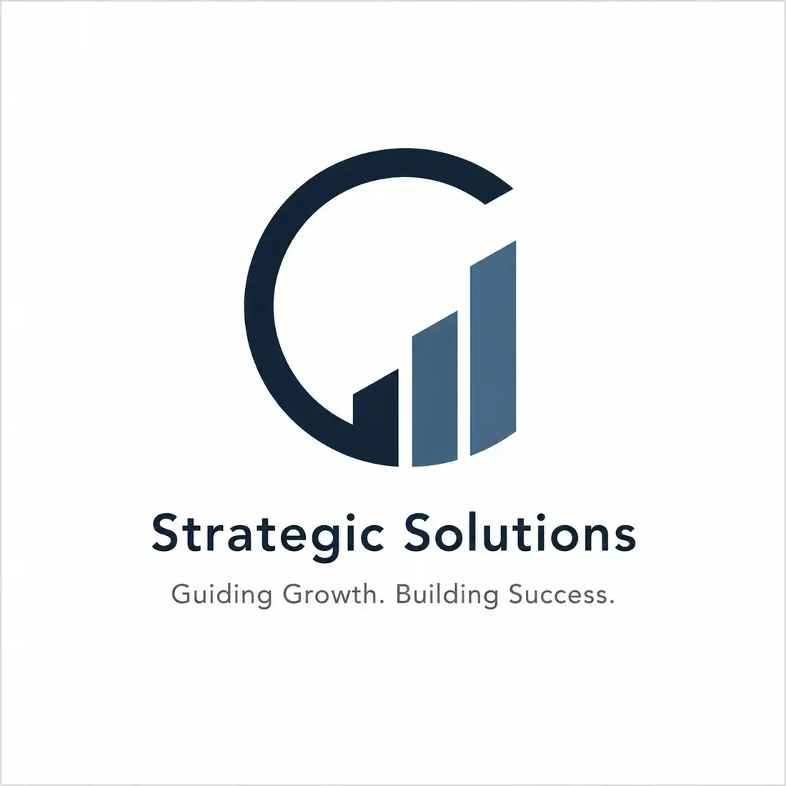
“A navy circle opening onto ascending bars for a consultancy called Strategic Solutions, navy and steel blue on white, a bold sans wordmark and the tagline guiding growth building success”
The most generic entry, and useful for exactly that reason: a category name, a category symbol and the category colour. Nothing here belongs to this firm rather than any other.
What actually decides it. Four things.
Blue is the category default because it reads as trustworthy and safe, and when every firm in the room reaches that conclusion the signal disappears. Look at what happens when a firm does not: Altivia on hot pink, Pinnacle on deep forest green, Elevate in brown and gold, Veritas in black on yellow. None of them reads as unserious, and every one of them is easier to remember than the two navy marks at the end of the row. Colour is the cheapest differentiation available to an advisory, and almost nobody spends it.
Three of the twelve marks above are built on ascending bars: Fortivo, Summitra and Strategic Solutions. It is a fine symbol, instantly understood, and it is available to literally every consultancy on earth, which means it distinguishes none of them. It also says growth, which your client already assumed you were selling. If you reach for it, ask what it is telling someone that the word Consulting beside it did not.
Advisory marks fail by trying to say growth and partnership and insight at once, which produces a shape that means nothing in particular. The naming has the same failure mode: Synergix and Strategic Solutions are describing a category rather than a firm, and no logo can rescue a name that could belong to anyone. Compare Clarion or Stratum, which commit to a single specific idea and let the mark carry it.
LinkedIn is where most consultancies are actually seen, and it crops to a circle at a small size. Render each of these at 32 pixels and the difference is stark: Altivia’s A, Pinnacle’s peak, Veritas’s W and Summitra’s bars still read, while Clarion’s concentric rings merge into a blur, Fortivo’s thin columns close up, and anything relying on the wordmark disappears entirely. That is not an argument against those marks, it is an argument for having a separable symbol variant from the start, which is a logo system question rather than a logo question.
Where it has to work. The real formats.
| Where | What it demands |
|---|---|
| Pitch deck title slide | Large and on a projector or shared screen. Colour accuracy varies wildly. |
| Proposal cover, printed | Often black and white on an office printer. |
| LinkedIn avatar | Cropped to a circle and small. A horizontal wordmark will not survive it. |
| Email signature | Tiny, wide, and frequently rendered on a white background only. |
| Conference badge and lanyard | Small, one or two colours, read at conversational distance. |
Every one of these is a variation, not a resize. Logo System produces each arrangement from one approved mark, with the computed minimum size and clear space, and this guide explains why those numbers matter.
Questions. Answered.
What makes a good consulting firm logo?
Distinctiveness, because nothing else is scarce in this category. There are no physical constraints forcing decisions, so consulting marks fail by converging: the same abstract geometry in the same blue, competent and forgettable. The two moves with the highest return are committing to a colour the category has not taken, and picking one specific idea rather than gesturing at growth, partnership and insight at once. In the gallery above, the pink, the forest green and the black on yellow are doing more work than any amount of geometry.
Should a consulting logo be abstract or literal?
Abstract is the norm and usually right, since consulting has no product to depict. The failure is abstraction that means nothing in particular, or abstraction everyone else already owns. The rising bar chart and the upward arrow are the clearest examples: instantly legible, and available to every competitor you will ever pitch against. If you go abstract, pick a single specific idea, a peak, a stratum, a clarion, and build one clear shape around it.
Does a consulting firm need a symbol at all?
Not necessarily. Consulting is sold through decks, proposals and conversation, where the name is written and spoken constantly, so a well-set wordmark carries recognition perfectly well. The one practical argument for a symbol is the circle crop: LinkedIn and most avatars need a square mark, and a wide wordmark cannot fill one. Test it honestly by rendering your logo at 32 pixels. If what survives is a blur, you need a separable symbol variant, not a different logo.
More industries: law firms, contractors, accountants, bars.
Your name, your prompt.
Or have your current logo scored on seven dimensions.